
Top 15 Best Free Icon Sets for UI Design
Icons are a critical part of any product as the inform the user experience. So weve put together a list of free sets that you can get started with.

Monty Hayton
November 30, 2022
.png)
Typography is so much more than just choosing beautiful fonts, it’s an essential component of UI design. Good typography will establish a visual hierarchy provide a graphic balance to the website, and set the product’s overall tone. Typography should guide and inform your users, optimise readability and accessibility, and ensure an excellent user experience.
It may seem like an insignificant part of the product and is just simply picking a font at random, but its not like that at all. Users can tell the difference between a well balanced typographic system and ones that aren't. Inconsistent or poorly arrange type can make users feel reluctant to use your products or make it difficult to engage or read your content.
Some designers can place to much emphasis on making type explicitly bold or over the top to try and make things more engaging, you can see lots of this kind of work on Dribbble and portfolio sites, however, almost all brands and products will have unique requirements and audiences that will respond beneficially to typography thats in harmony with the page and the product content.
Fonts are notoriously difficult to choose and match to your product type and overall company ethos, which is why more often than not, people end up choosing the same outdated and visually stultifying fonts such as Source Sans, Lato, Times New Roman, or Monsterrat. These fonts can significantly reduce the overall experience of your users because the fonts have not been design to be engaged with the way media is today. So we have put together a list so you can find the best fonts for your projects, both commercial and personal. But first lets go over some of the basics of Typography so you can make an informed choice regarding your font.
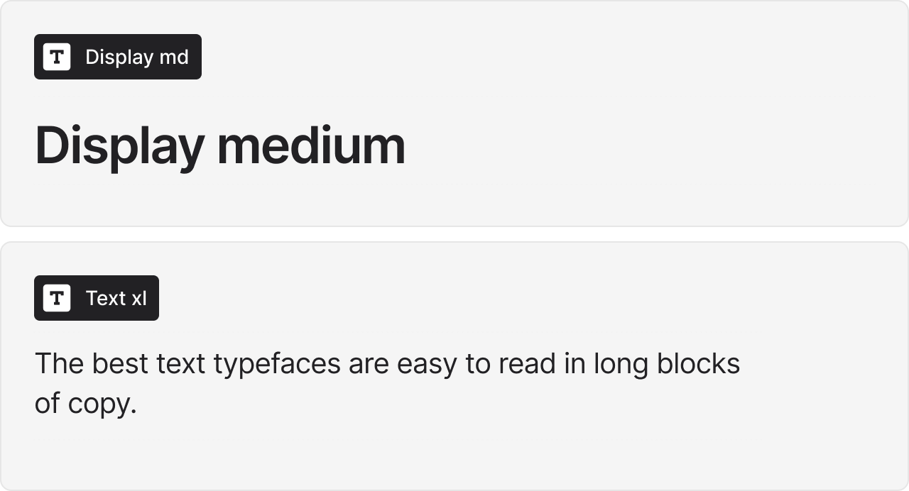
The best text typefaces are easy to read in long blocks of copy. They do not call much attention to themselves and have been designed to perform best between 6-point and 16-point. Conversely, display typefaces are used to entice a reader into text copy, to create a mood or feeling, or to announce important information. Sometimes, they accomplish all these purposes at the same time.
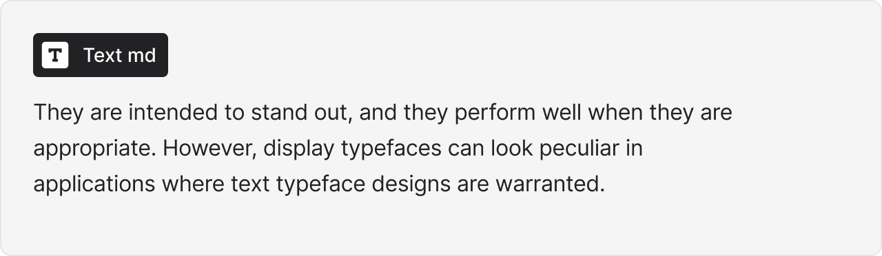
They are intended to stand out, and they perform well when they are appropriate. However, display typefaces can look peculiar in applications where text typeface designs are warranted. Display styles should generally be applied as your page or application heading H1, H2, etc, and “text” styles should be used for all other type based content such as body copy, paragraph text and other UI text.
Every typographic system has a base font. This is the “default” font size or style that is used for most text elements within a website or application. Setting your base font size is an important step for responsive design, and will make it easier for development handoff as the base font size is set off of the body tag in CSS.
In development and on almost all browsers the default text size is 16px. This means that when front end developers go to start optimising your designs for responsive formats, they can use properties such as em to maintain relative size at different scales.
Your base font should be easily readable at regular distances from your devices. Like when reading a book, it should be scannable and not strain the eyes too much. You can choose a different base font size, but you should be aware that it will impact how your content looks overall.
The main purpose of letter-spacing is to improve the legibility and readability of the text. Words act differently depending on their size, color, and the background they are on. By adjusting letter-spacing to the environment you are working with you will help readers consume your information faster, and more efficiently.
Each font is designed with specific uses in mind and often wont universally look legible at all sizes. Some fonts are great at display and heading sizes, whilst others look more balanced as text and UI copy. This doesn't mean you should go and start looking for font pairings straight away, but it might be worth considering the different typefaces and how they can be applied to your project.
Stratis leverages Inter as its main font as this works at all sizes and only requires a small amount of tweaking to look great. There are other fonts that are comparable to Inter, but this one is used in most applications and is often a default font for certain browsers.
If you do choose the same font for both your headings and text styles, remember to test them before you finalise anything, as the letter spacing doesn't apply to all sizes and needs to be adjusted. How much you adjust is up to you and is what you think looks pleasing and is easy to read. But an example of how this can look odd is at display sizes. Display is quite large which means whatever minor spacing at body text size now looks very large and the font less visually uniform. At the current time Fimga only allows you to set the spacing as a percentage value which is now how letter spacing is calculated in CSS, so bear in mind for developers that the value with need to be either a hard-pixel value of a rem/em value.
.png)
Optimal line height ensures that lines of text have enough spacing between them to achieve decent levels of readability. This is becoming more recognised as a standard, with even Google's PageSpeed Insights suggesting it as a manual check or a flag if the text contains links too close together as a result of line height.
WCAG guidelines have helped prvoide a legible base starting point for body text that says that line heights should be 1.5x the font size. So if the body text is 16px, then the line height would need to be 24px.This rule however needs to be adjusted when dealing with larger font sizes, as the larger the font gets, the smaller the line height needs to be.
A good general rule is that headings should have a line height between 1 - 1.25px. This usally works well and makes the text looks well balanced. So if your display text is 60px, and you set the line height to 60px x 1.2 it will result in a 72px line height which looks good.Our system has optimised the line heights for each font weight so it looks engaging and balanced, yet you can change these if you feel like they arent appropriate for your content.
For a long time, designers have been using fonts that are easy to read and understand. However, it is becoming more important for product designers to consider the right typography to communicate with the users. This can be difficult as there are thousands of fonts released every year.
Most fonts are not going to be able to work at scale, and you shouldn't really invest any and custom paid fonts unless you're absolutely sure that i can work in your applications.
To find out if a font has product design applications you can look out for a few things that will make your decision easier.
Its good long term planning to make sure you choose a font that has an adequate amount of weights to cover all the use cases you will encounter. You should make sure the font has at least at least 5 primary weights that includes italics. These weights would be light, regular, medium, semibold and bold. These weights will cover about 95% of all SaaS product design use cases as minimal type variations helpes reinforce semantic applicability.
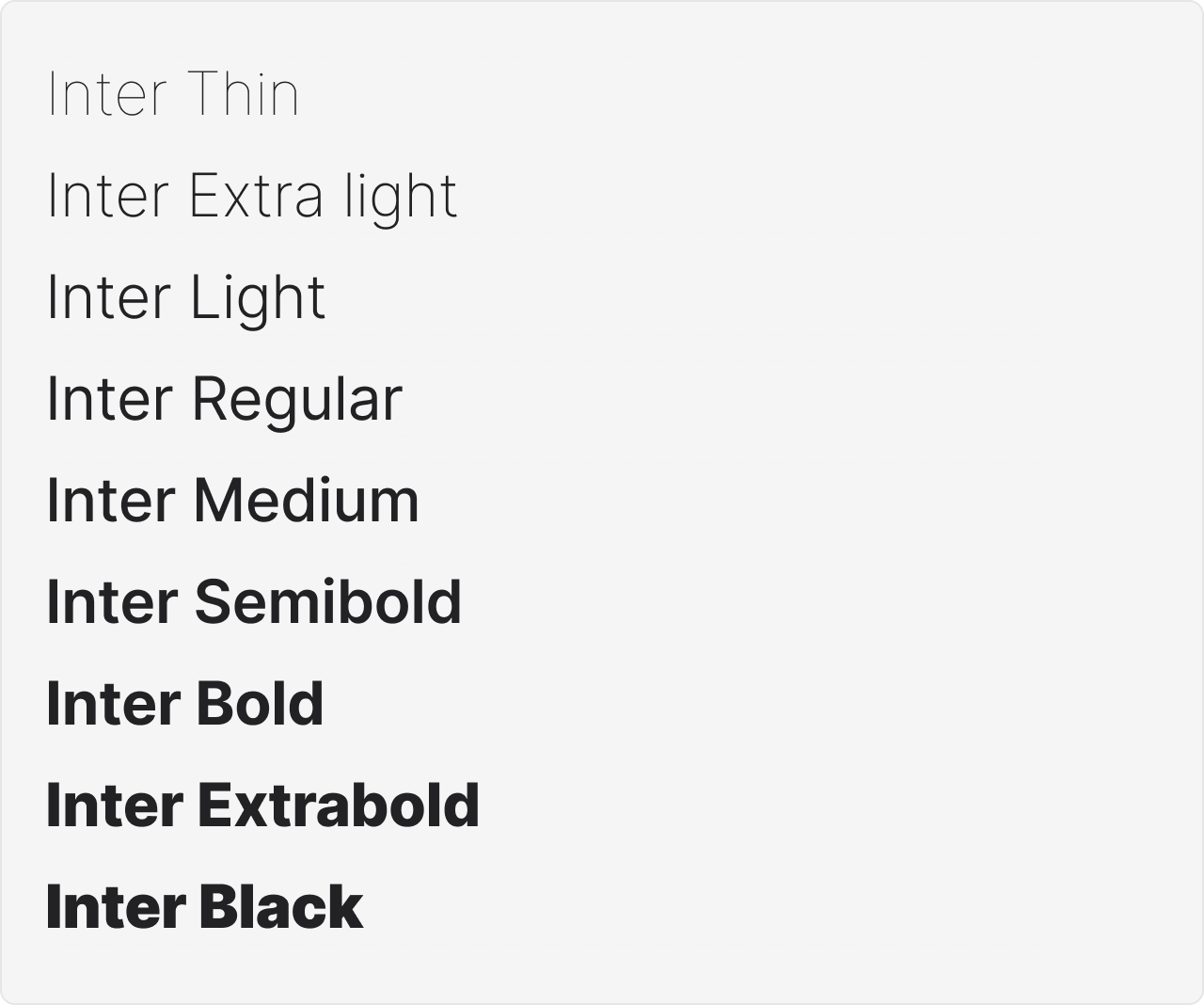
Font that have various font weights have usually had more time spent on them to ensure they can be used correctly, so its best to get a family that has more styles than you need, than trying to work with only a handful of styles and compromise your designs.
There is a reason why alsmot every machine on earth has the same set of universal fonts, its because they have been proven to be the most scalable and useful for a wide range of application. Everything except comic sans. So when youre first deciding on what font to use, you cant go wrong with the same fonts multi-billion dollar industries still use today. Most web applications and contemporary websites are using either all sans-serif fonts or a combination of display serif and sans-serif for copy.
The more neutral your font is the better it will be for your applications so the content can be the thing that stands out. Sometimes you might want a very visually eccentric font for branding but for most other applications, its not required. So try and put your project needs ahead of any personal stylistic preferences at the start, so long as youre using a design system, you can swap the fonts out later on if you feel like its needed. So if youre struggling to find fonts that your like, or cant balance complicated vintage fonts or font combinations, then dont worry and jut keep thing simple and use some of the fonts recommended in this post or on Google fonts.
If you need to choose a font but still arent sure, try thinking of some applications or websites that youve been to where you thought the typography was engaging and worked well for its audience.
.png)
We started to use IBM plex sans a lot in our projects after going through IBM’s design system Carbon. You can use this font for free as its part of Googles font library. This font is great for building enterprise tech applications as thats what IBM does. As you can see, major organisations use fonts that are available for free use, so not every brand or product needs a custom typeface to make it stand out. If you do find a font thats not free, see if the creator or publishing house allow free trials, sometimes the advertising for fonts is so alluring but the actual application doesn't end up matching that initial reaction.
When you start venturing into the worls of multiple fonts, it can get very cluttered and overwhelming quickly. Most applications dont utilise several fonts as its just two difficult to balance them in dense UI. Lots of companies often have one font for their marketing and external pages and then another for the core product UI.
This is a good practice as you benefit from the unqiue font for your advertising, but your application font is streamlined and legible and is easy to scale up and down without having to radically alter your designs. So to start out i would just select one font, or if you have to have two, dont use more than two.
This means you can learn how to optimise font weights instead of just changing font, sometimes switching fonts can feel like an engaging change because its different but doesnt actually achieve anything.
So now comes the actual recommendations. This list is a reflection of fonts we have personally and professionally used in our projects. These are the fonts we come back to each time and its not a list of 100's that youll never use, but a refined swiss army knife list of the best free and high-quality fonts that you can use for all your web and UI design projects

Inter is open-source sans-serif typeface font family created by renowned Swedish designer and font maker Rasmus Andersson. The font was crafted specifically for computer screens to enhance the legibility of small text sizes. It was first released on August 20, 2017, and was initially known as Interface.The Inter font has been widely described as a cross between the popular Helvetica and San Francisco (SF) Pro. Indeed, it’s easy to pick up several characteristic elements of Helvetica and SF Pro fonts when you examine Inter up-close..
The family is available in nine weights with matching italics, as well as a variable font version. Inter is 100% free for personal projects and commercial use.

Roboto is a free high contrast sans-serif font which has been used across millions of applications. Designed by Christian Robertson Roboto has a dual nature. It has a mechanical skeleton and the forms are largely geometric. At the same time, the font features friendly and open curves. While some grotesks distort their letterforms to force a rigid rhythm, Roboto doesn’t compromise, allowing letters to be settled into their natural width.
Roboto belongs to the neo-grotesque genre of sans-serif typefaces. It includes Thin, Light, Regular, Medium, Bold and Black weights with matching oblique styles rather than true italics. It also includes condensed styles in Light, Regular and Bold, also with matching oblique designs. The regular family has 12 weights, which can be used alongside the Roboto Condensed family and the Roboto Slab family.
.png)
IBM Plex is an open source typeface superfamily conceptually designed and developed by Mike Abbink at IBM in collaboration with Bold Monday to reflect the design principles of IBM and to be used for all brand material across the company internationally. Plex replaces Helvetica as the IBM corporate typeface after more than fifty years, freeing the company from extensive license payments in the process.
The IBM Plex family comes in Sans, Serif, Mono and Sans Condensed, all with roman and true italics. The fonts have been designed to work well in user interface (UI) environments, as well as other mediums.

DM Sans is a geometric low-contrast sans-serif typeface designed by Colophon Foundry. It was commissioned by Google Fonts and released in 2019. The design was derived from Poppins, an open-source family from Indian Type Foundry. DM Sans is available in three weights with matching italics, as well as a monospaced version and serif version that comes in both text and display optical sizes.
DM Sans supports a Latin Extended glyph set, enabling typesetting for English and other Western European languages. It was designed by Colophon Foundry, that started from the Latin portion of ITF Poppins, by Jonny Pinhorn.
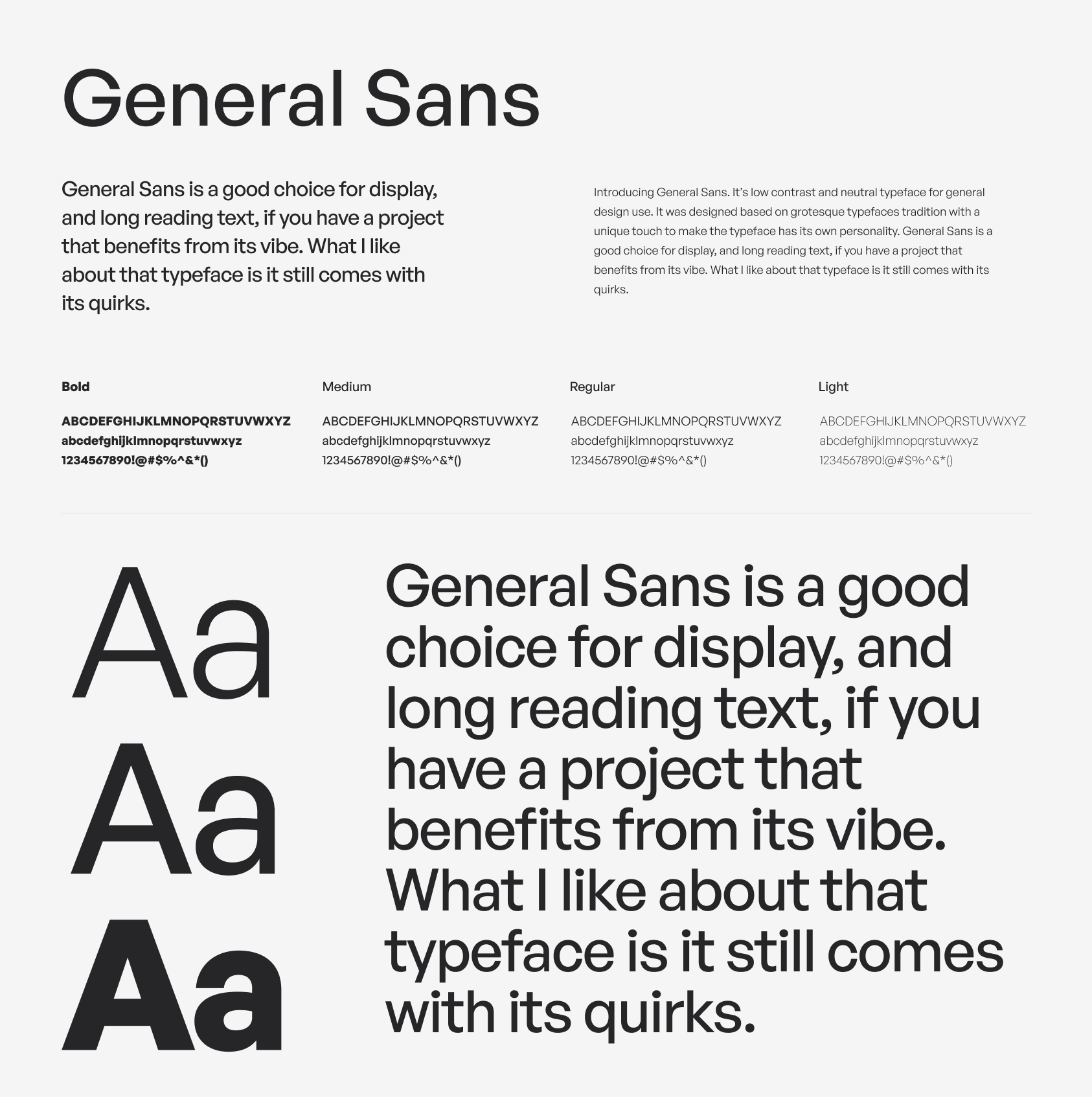
General Sans is a variable weight typefaceby Frode Helland, pubished by Indian Type Foundry. Its an excellent selection for use in branding, or in other kinds of corporate identity design. It may also be put to good use in editorial designs for publications about contemporary lifestyle issues. General Sans is the work of Frode Helland, a type designer from Norway.
It has large x-height, generous width, almost consistent mono-line look on all weights and the most noticeable part is the unique terminal form of lowercase ‘f’, ‘j’, ‘r’, and ‘y’ which have straight horizontal side and curved line in the other side.
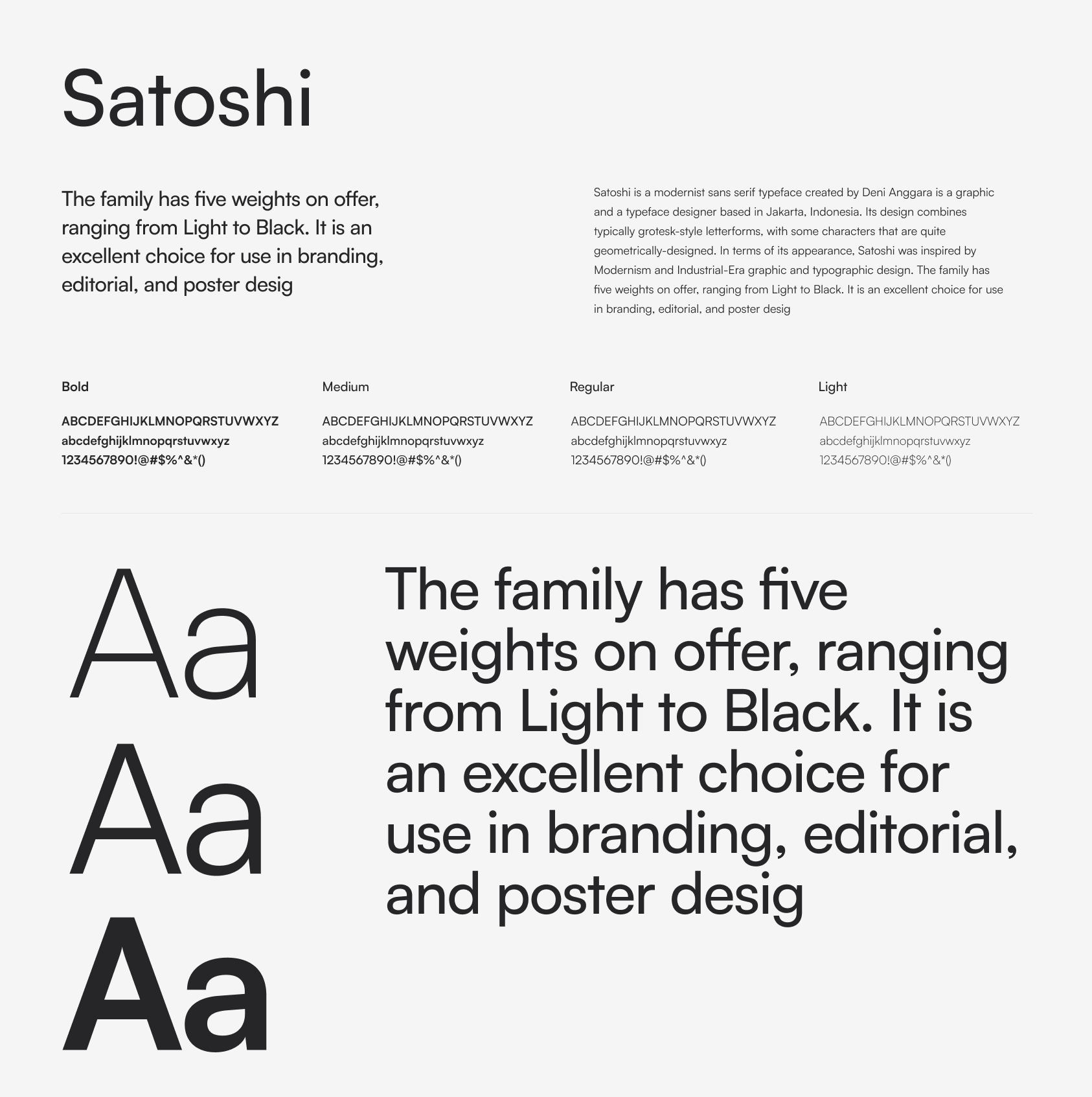
Satoshi is a modernist sans serif typeface created by Deni Anggara is a graphic and a typeface designer based in Jakarta, Indonesia. Its design combines typically grotesk-style letterforms, with some characters that are quite geometrically-designed. In terms of its appearance, Satoshi was inspired by Modernism and Industrial-Era graphic and typographic design. The family has five weights on offer, ranging from Light to Black. It is an excellent choice for use in branding, editorial, and poster design.
It shares some similarities with inter and Circular as it combines various Grotesk styles, It is vailable in 10 static and two variable styles as well as 135 languages. It's 100% free for personal projects and commercial use.
One caveat to Satoshi is that is does have some legibility issues between 8px - 14px, this is due to a lower than normal x-height which can mean you will need to make som adjustments when dealing with text elements at that scale.

Plus Jakarta Sans is a fresh take on geometric sans serif styles, designed by Gumpita Rahayu from Tokotype. The fonts were originally commissioned by 6616 Studio for Jakarta Provincial Government program's +Jakarta City of Collaboration identity in 2020.
Taking inspiration in Neuzeit Grotesk, Futura, and 1930s grotesque sans serifs with almost mono-linear contrast and pointy curves, the fonts consist of modern and clean cut forms, the x-height dimension slightly taller to provide clear spaces between caps and x-height, and also equipped with open counters and balanced spaces to preserve the legibility at a large range of sizes.
Jarkata sans comes in 14 static and 2 variable styles and is open-source and available for free and commercial use.
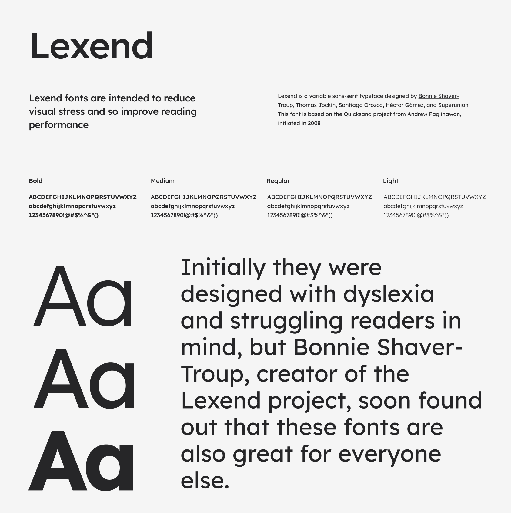
Lexend is a variable sans-serif typeface designed by Bonnie Shaver-Troup, Thomas Jockin, Santiago Orozco, Héctor Gómez, and Superunion. This font is based on the Quicksand project from Andrew Paglinawan, initiated in 2008. Quicksand was improved in 2016 by Thomas Jockin for Google Fonts. Thomas modified Quicksand for the specialised task of improving reading fluency in low-proficiency readers (including those with dyslexia.)
Lexend fonts are intended to reduce visual stress and so improve reading performance. Initially they were designed with dyslexia and struggling readers in mind, but Bonnie Shaver-Troup, creator of the Lexend project, soon found out that these fonts are also great for everyone else.
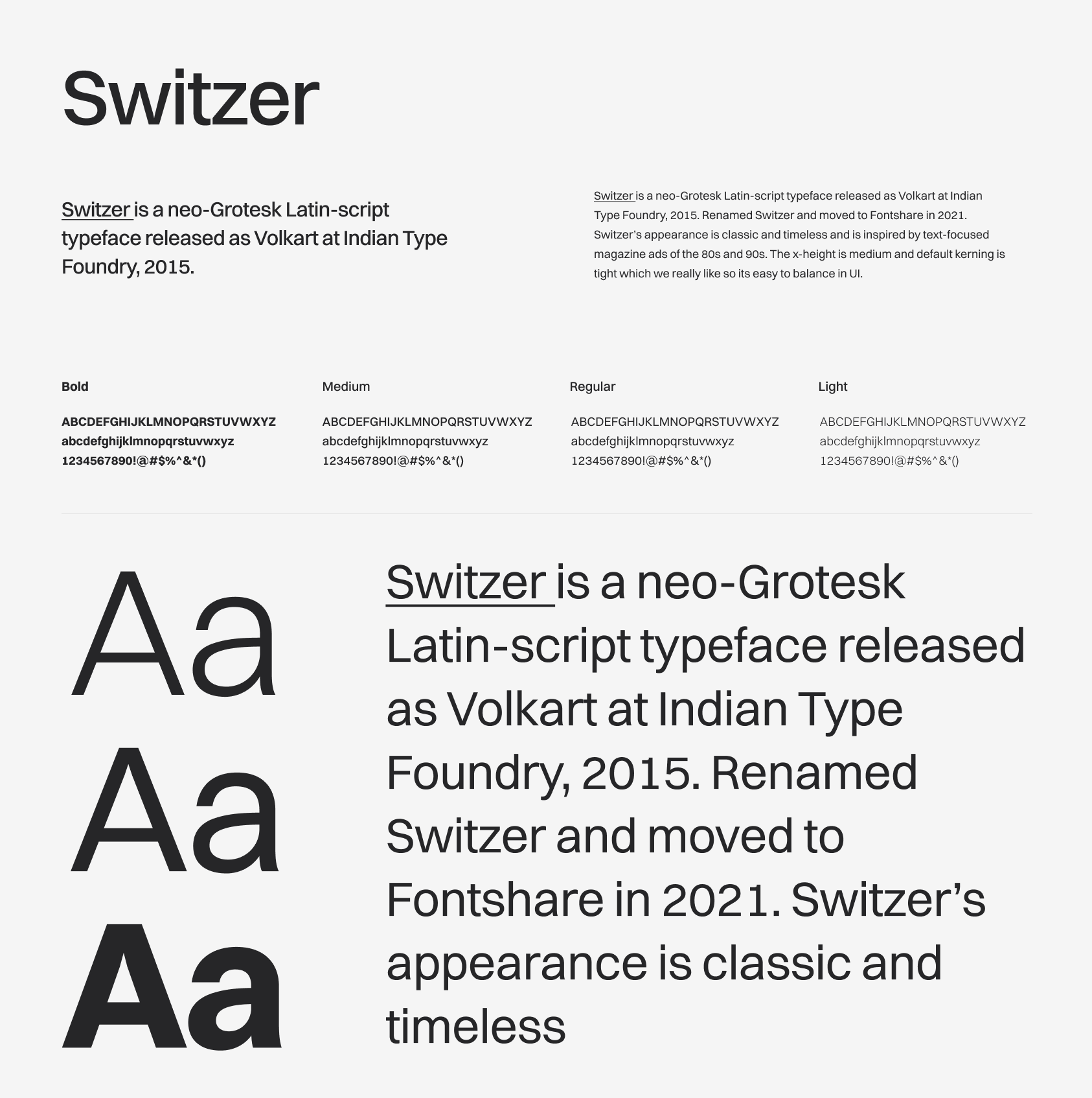
Switzer is a neo-Grotesk Latin-script typeface released as Volkart at Indian Type Foundry, 2015. Renamed Switzer and moved to Fontshare in 2021. Switzer’s appearance is classic and timeless and is inspired by text-focused magazine ads of the 80s and 90s. The x-height is medium and default kerning is tight which we really like so its easy to balance in UI.
This latin script comes with 18 styles; nine of those are italics and has support for 135 langauges. Its a great font that works well for complex product UI and scales well fro smaller screen sizes and mobile devices. Switzer can be used free for both personal and commercial projects.
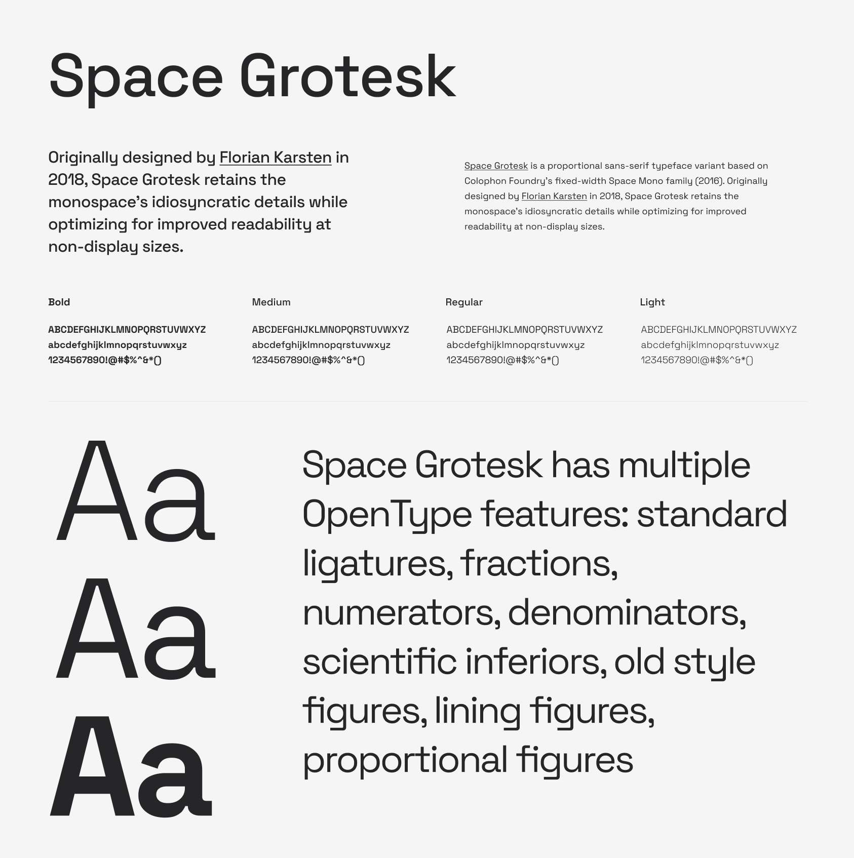
Space Grotesk is a proportional sans-serif typeface variant based on Colophon Foundry's fixed-width Space Mono family (2016). Originally designed by Florian Karsten in 2018, Space Grotesk retains the monospace's idiosyncratic details while optimizing for improved readability at non-display sizes.
Space Grotesk includes Latin Vietnamese, Pinyin, and all Western, Central, and South-Eastern European language support, as well as several OpenType features (old-style and tabular figures, superscript and subscript numerals, fractions, stylistic alternates).

Figtree is a clean yet friendly geometric sans serif font designed by designed by Erik Kennedy,. who has great courses on how to learn UI design.Figtree is great for usage in web and mobile apps. It's light-hearted and crisp when used for text, yet still retains some punch when used in uppercase – perfect for buttons and short labels. The thicker weights have a distinctly friendlier character, great for headlines of more personable brands.
Its most characteristic forms are t, f, y – all with unabashed curves that convey energy and fun. The font has a high x-height to maximise legibility and is a nice minimal and versatile font to use for UI design. Figtree is free for personal projects and commercial use.
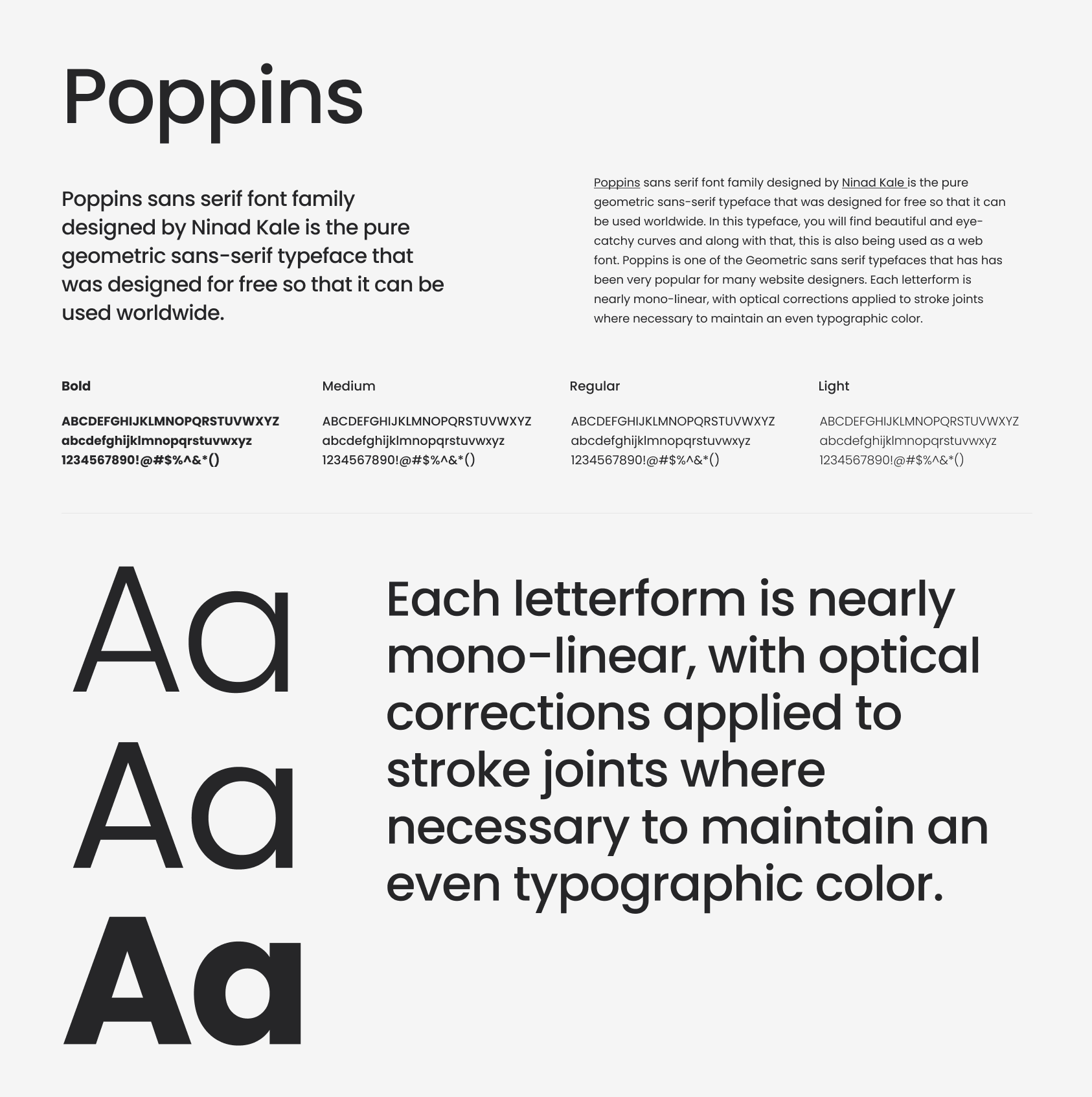
Poppins sans serif font family designed by Ninad Kale is the pure geometric sans-serif typeface that was designed for free so that it can be used worldwide. In this typeface, you will find beautiful and eye-catchy curves and along with that, this is also being used as a web font. Poppins is one of the Geometric sans serif typefaces that has has been very popular for many website designers. Each letterform is nearly mono-linear, with optical corrections applied to stroke joints where necessary to maintain an even typographic color.
Poppins has support for 245+ languages and over 24 variable weights. Poppins is available to use free in both personal and commercial projects.

Aktiv Grotesk is a condensed Sans Serif font crafted & designed by Dalton Maag. The font is a minimal 21st-century interpretation of a grotesque sans-serif typeface so its an ideal choice for branding applications that require a variety of uses. This font is not free per-se but it is a font thats included in an Adobe CC subscription. Once you are subscribed you will be able to use this in all commercial projects.
Grotesque fonts are increasing in their popularity due to the nature of how we consume media and manage data. Grotesque san-serif fonts are versatile, beautiful, and popular—some of the most popular sans serifs out there are neo-grotesque typeface designs. This is likely because of their neutral, clean aesthetic, as well as their ability to serve so many different roles in a design's composition. Aktiv Grotesk takes an authoritative but neutral position, supporting any message without overpowering it. A flexible and diverse family of 24 styles with matching italics, from Hairline to Black.
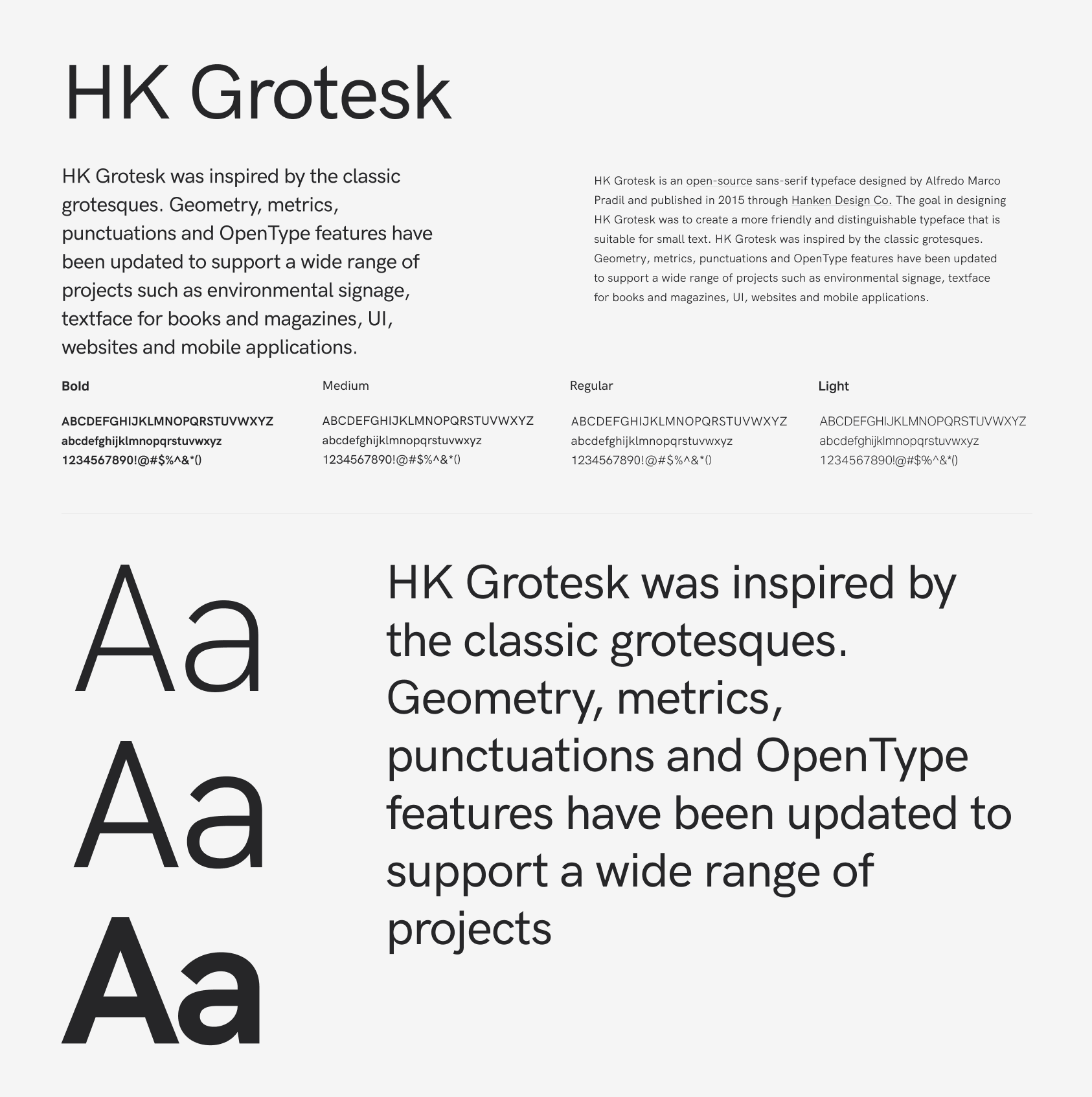
HK Grotesk is an open-source sans-serif typeface designed by Alfredo Marco Pradil and published in 2015 through Hanken Design Co. The goal in designing HK Grotesk was to create a more friendly and distinguishable typeface that is suitable for small text. HK Grotesk was inspired by the classic grotesques. Geometry, metrics, punctuations and OpenType features have been updated to support a wide range of projects such as environmental signage, textface for books and magazines, UI, websites and mobile applications.
HK Grotesk comes in 18 styles and is available for free and commercial use in your projects.
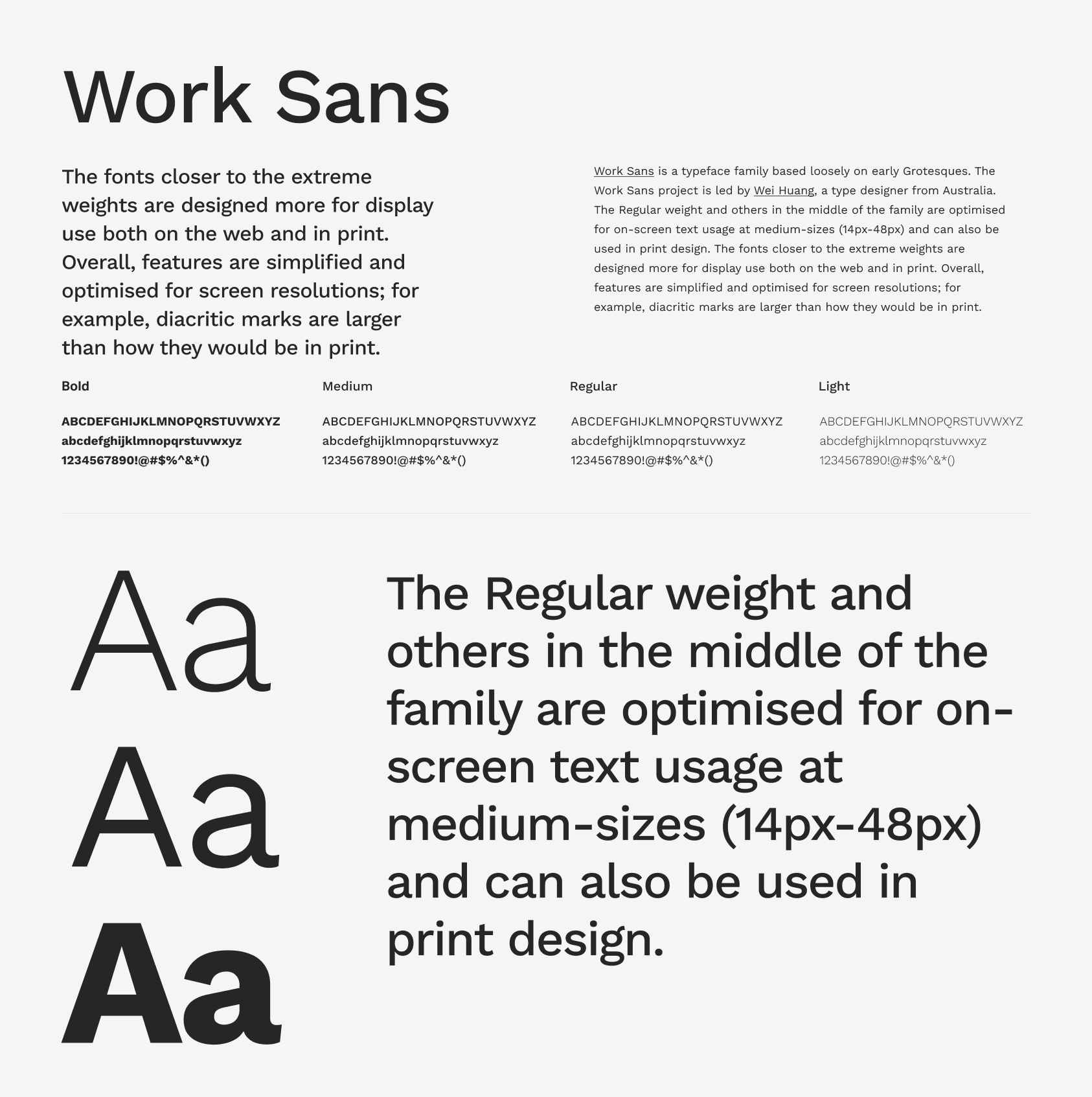
Work Sans is a typeface family based loosely on early Grotesques. The Work Sans project is led by Wei Huang, a type designer from Australia. The Regular weight and others in the middle of the family are optimised for on-screen text usage at medium-sizes (14px-48px) and can also be used in print design. The fonts closer to the extreme weights are designed more for display use both on the web and in print. Overall, features are simplified and optimised for screen resolutions; for example, diacritic marks are larger than how they would be in print.
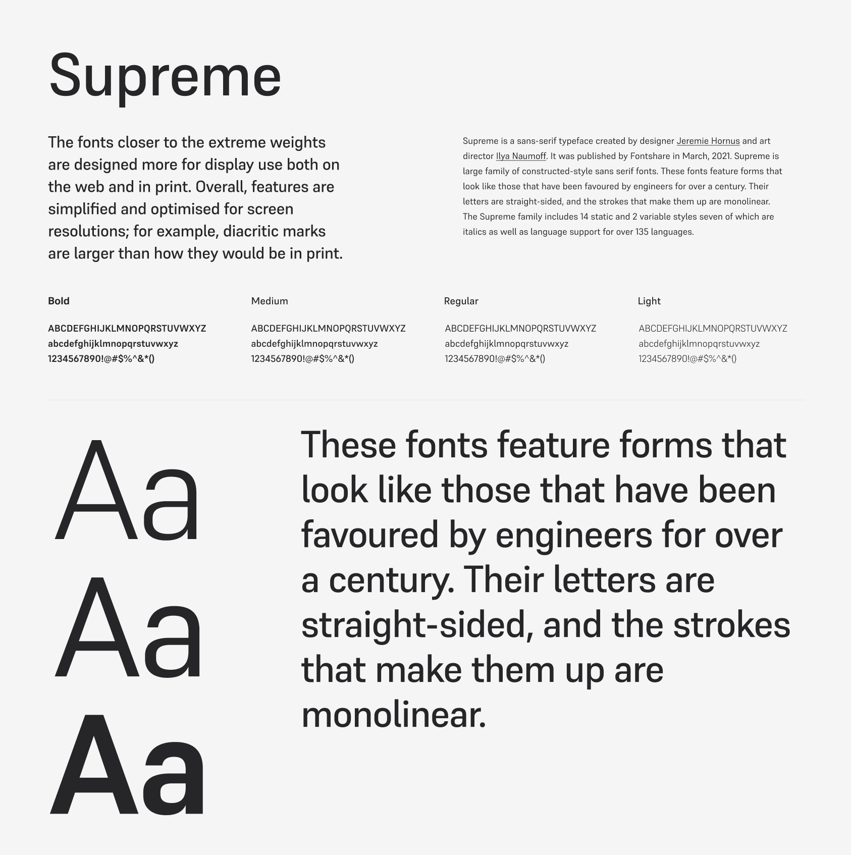
Supreme is a sans-serif typeface created by designer Jeremie Hornus and art director Ilya Naumoff. It was published by Fontshare in March, 2021. Supreme is large family of constructed-style sans serif fonts. These fonts feature forms that look like those that have been favoured by engineers for over a century. Their letters are straight-sided, and the strokes that make them up are monolinear. The Supreme family includes 14 static and 2 variable styles seven of which are italics as well as language support for over 135 languages.
The x-height is moderate, but due to its thinner compositions it sill functions well at smaller sized and for UI based product work. Supreme is available for download from fontshare and is free for personal and commercial projects.
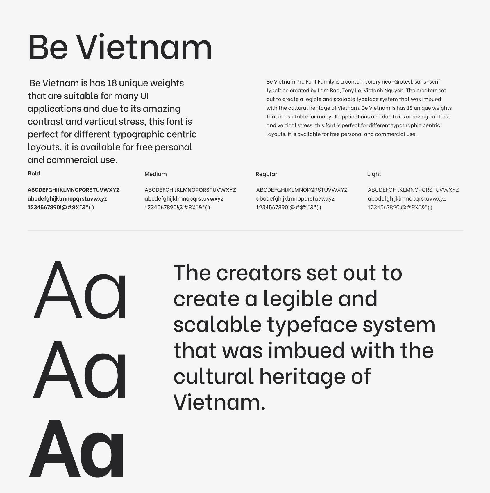
Be Vietnam Pro Font Family is a contemporary neo-Grotesk sans-serif typeface created by Lam Bao, Tony Le, Vietanh Nguyen. The creators set out to create a legible and scalable typeface system that was imbued with the cultural heritage of Vietnam. Be Vietnam is has 18 unique weights that are suitable for many UI applications and due to its amazing contrast and vertical stress, this font is perfect for different typographic centric layouts. it is available for free personal and commercial use.
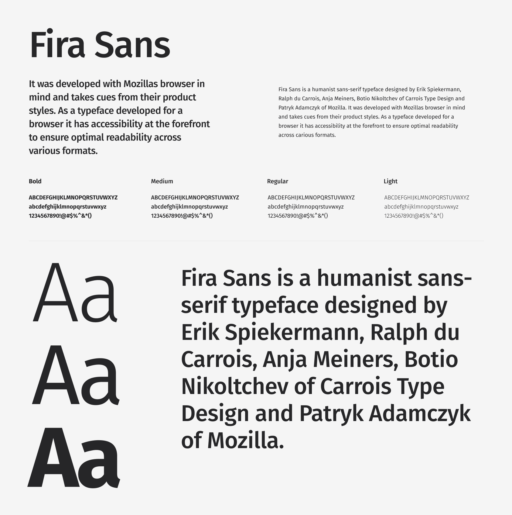
Fira Sans is a humanist sans-serif typeface designed by Erik Spiekermann, Ralph du Carrois, Anja Meiners, Botio Nikoltchev of Carrois Type Design and Patryk Adamczyk of Mozilla. It was developed with Mozillas browser in mind and takes cues from their product styles. As a typeface developed for a browser it has accessibility at the forefront to ensure optimal readability across various formats.
It contains 18 static and two variable styles and is protected through the SIL Open Font License Scheme.
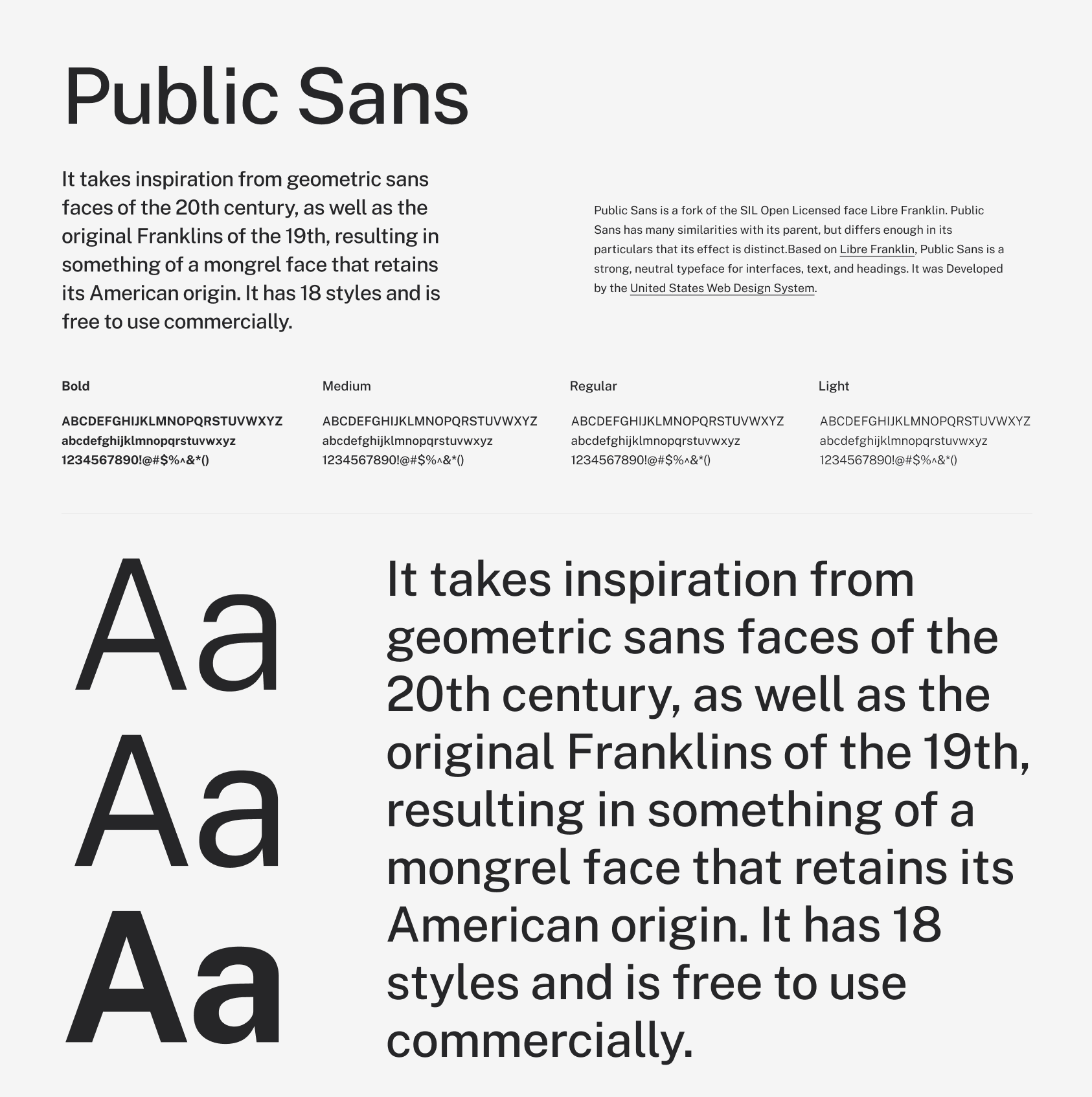
Public Sans is a fork of the SIL Open Licensed face Libre Franklin. Public Sans has many similarities with its parent, but differs enough in its particulars that its effect is distinct.Based on Libre Franklin, Public Sans is a strong, neutral typeface for interfaces, text, and headings. It was Developed by the United States Web Design System.
Public sans has its focus on long-form reading and neutral UI applicability. It takes inspiration from geometric sans faces of the 20th century, as well as the original Franklins of the 19th, resulting in something of a mongrel face that retains its American origin. It has 18 styles and is free to use commercially.
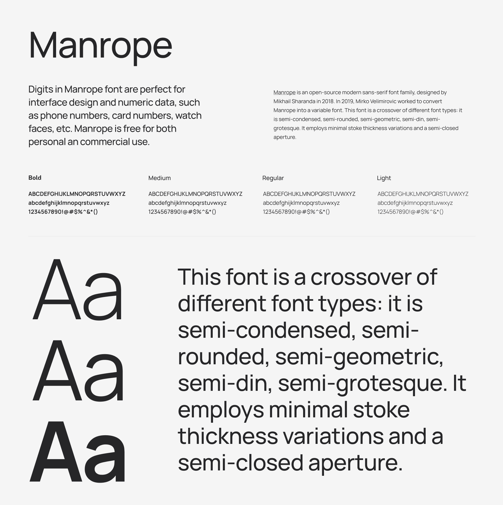
Manrope is an open-source modern sans-serif font family, designed by Mikhail Sharanda in 2018. In 2019, Mirko Velimirovic worked to convert Manrope into a variable font. This font is a crossover of different font types: it is semi-condensed, semi-rounded, semi-geometric, semi-din, semi-grotesque. It employs minimal stoke thickness variations and a semi-closed aperture.
Digits in Manrope font are perfect for interface design and numeric data, such as phone numbers, card numbers, watch faces, etc. Manrope is free for both personal an commercial use.
Theres a lot of rabbit holes you can go down when looking at fonts, and it might be difficult to understand if youre just starting out or only work on certain project types as to why you would go and invest in a premium font. For the most part, the free fonts are more than enough and you can create great UI and projects with them, if you do want to add that last few percent and make your UI really unqiue, you can visit some of the sites below to discover new fonts.
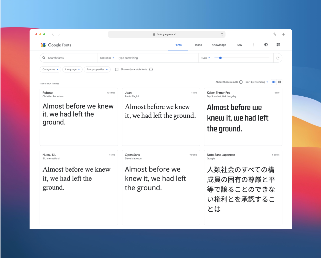
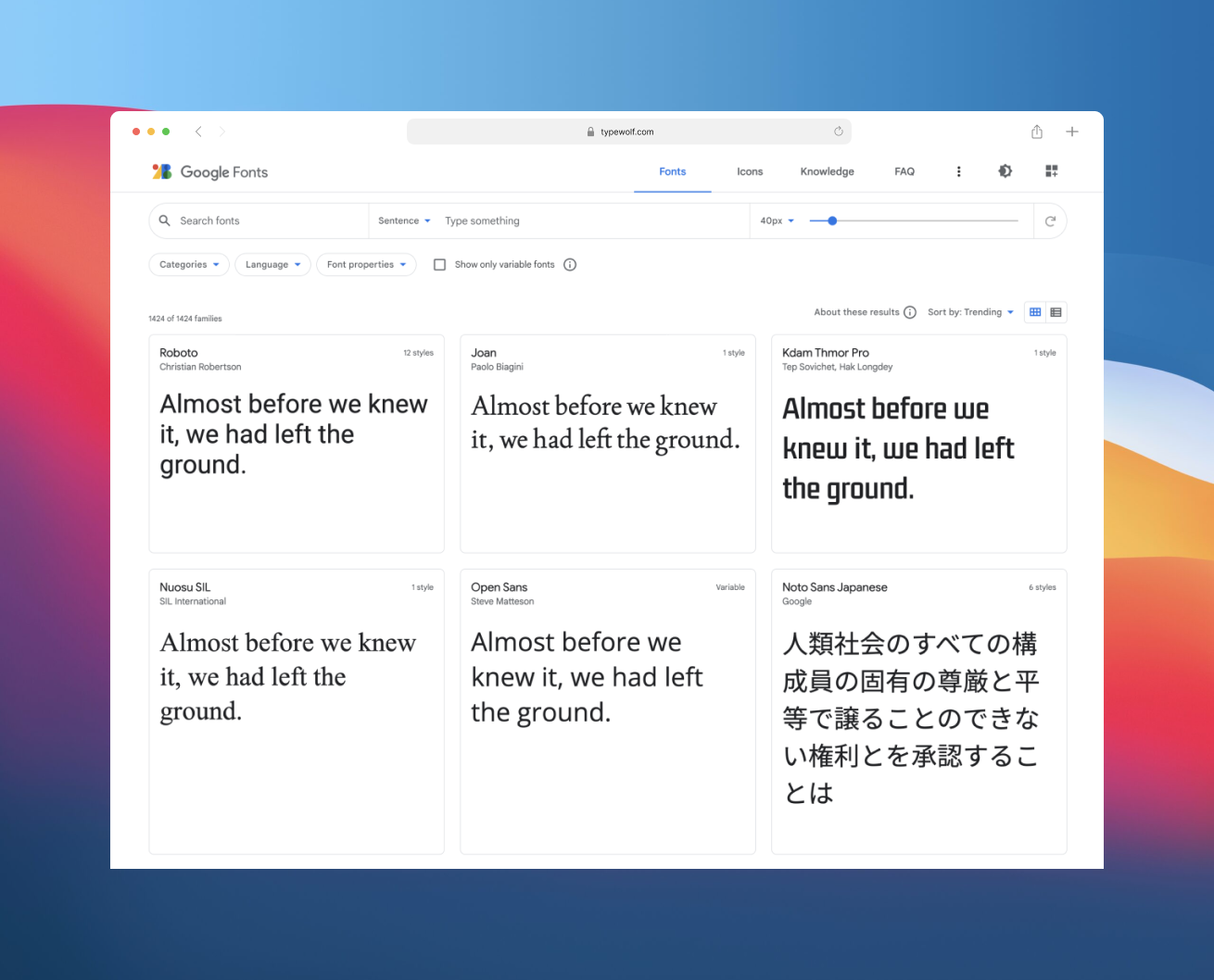
Google Fonts is among the most popular and most used font resources in the world. It’s an open source library, with an impressive catalog of 980 fonts that can be used in 135 languages. And you can get them all for free and create some stunning Google Font combinations for your site.
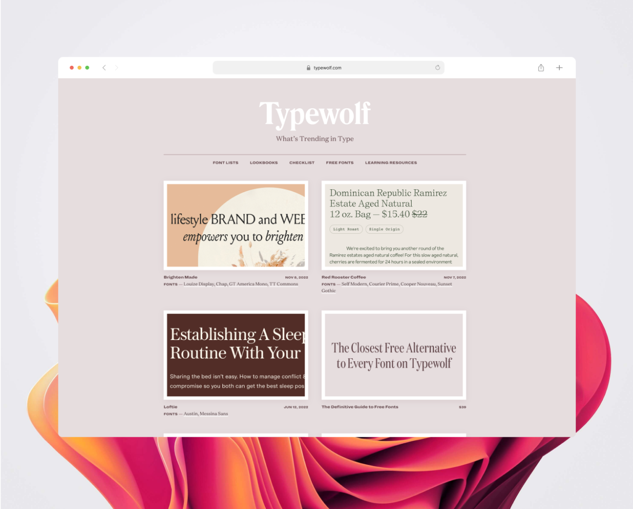
Typewolf is an independent typography resource created by Jeremiah Shoaf. The site gets over 350,000 unique visitors a month; running it is expensive and time consuming. If you find Typewolf useful, please consider supporting the site to help make it a sustainable side project.
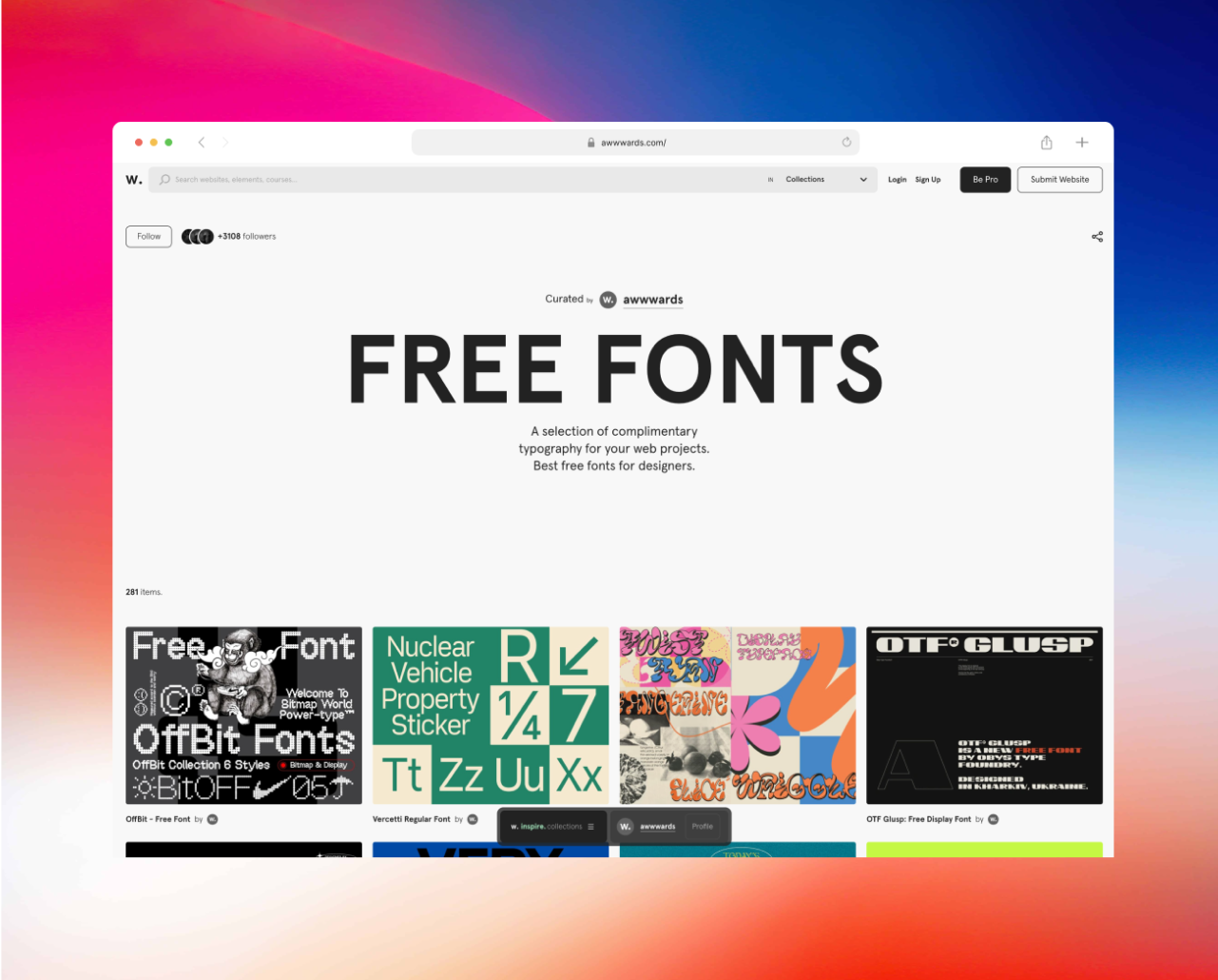
Awwwards has put together a selection of complimentary typography for your web projects. Best free fonts for designers, and a unqiue array including their application with relevant website demonstrations makes this a really great way to see how the fonts can be utilised.
Fonts In Use is a public archive of typography indexed by typeface, format, industry, and period. Supported by examples contributed by the public, we document and examine graphic design with the goal of improving typographic literacy and appreciation. Designers use our site for project research, type selection and pairing, and discovering new ways to choose and use fonts.
Adobe Fonts is a collection of over 20,000 different typefaces, and it is free with your subscription to Creative Cloud. If you’re not using CC, you can even subscribe separately so you can still utilize the collection.
{{content-divider}}
This post is an exert from Stratis UI, one of the largest Figma UI kit and design system in the market today. Stratis UI as more in depth and specific advice and best practice information within the Figma file which you can preview here and purchase here,
Stratis UI is the one of the largest Figma UI kits and design system in the world. Stop wasting your time recreating the same components and fast-track your workflow to take on more, by doing less. Our kit is the perfect starting place for any project whether its crafting beautiful websites and marketing collateral or developing design systems and UI frameworks for enterprise level products with suites of tools. Our kit has made sure we covered every use case you could need and reflected that in out massive component library.
You can check out a preview of the PRO version here can preview here and purchase here, as well as clone our 100% free version of the kit which is already a substantial amount of content. Still not convinced, heres a short video so you can learn more about what Stratis can do.


.png)


