
Top 15 Best Free Icon Sets for UI Design
Icons are a critical part of any product as the inform the user experience. So weve put together a list of free sets that you can get started with.

Monty Hayton
November 30, 2022
UI design is a fine science a lot of the time, there are many elements that can make or break a good experience. Its all about the nuance of how components, styles and brands combine to provide positive and useful tools.
One such nuance is the use of UI icons in modern product design. Icons are essential in building our your product and providing clear visual cues to your users to supplement text and other content. So which icons do you use for your project? This is a difficult questions as every project is unique and has its own branding, objectives and designers that will create the UI.
A quick google search can show you just how many options you have to choose from. A near unending mass of icon sets and libraries and illustrations. A lot of these options are also open source and 100% free, but they're are not all of equal quality or utility.
When we were building our own icon library we went through dozens of other paid libraries until we realised that most libraries were let down by several key factors. Size, quality and consistency. A lot of the sets had all three, meaning they would be a waste of money that could be invested elsewhere. So we found that often the best libraries turned out to be free open source ones. We know that choosing the right set of icons is of paramount importance to the effectiveness of the product so we made sure to include only what we feel was the highest quality and most versatile icons sets for modern UI design.
We kept the size of our list small as you dont need 100 libraries just in case, you need the one right tool and then to refine how you implement it. Most icons end up being fairly similar in the shape so you just need to pick the one that suits your particular aesthetic needs.
The word “iconography” is rooted in the Greek words ikon and graph where the word ikon means “image” and graph means “to write.” Artists, artisans and craftspeople have been using icons and symbols to represent aspects of their cultures and societies for millennia.
Iconography refers to a collection of particular types of images used by artists or designers to communicate deeper meanings in their artwork. That meaning can be associated with a real-world object or action, which helps reinforce the user behaviour.
Contemporary icons in computing are small graphical representations of a program, feature, or file. When you click an icon, the associated file or program opens or an action is performed. Icons help users quickly identify the type of file represented by the icon.Icons evolved to represent the physical analogs of that icon.
When you see a trash can or recycle bin icon, you know that its where you delete or remove items as that's how it works in the physical world. If you take these examples below, you can see very quickly without text what their meaning or hidden action is.
.png)
As you can see, most of these icons are fairly generic in their morphology, and you would be right to make your versions of these actions the same, as these are universal actions that almost all applications use.
You have undoubtedly seen most of these icon shapes before, as they represent real work objects that are now universal in their explicit functions. So you dont need to try and reinvent the wheel when it comes to creating new icons or choose and icon set. In fact using icons that look radically different for familiar actions will only harm the experience, not help it.
You cans till add visual falir and stylistic choices to your icons, you just have to be a bit more considered and edit with a light touch. As icons are such small glyphs you only need to make minor adjustments to get a set of icons that looks radically different, this is sometimes just down to stroke width or color. If you look at out Stratis UI icons, you can see the two version and how they have a different feel.
Icons are ubiquitous, they belong in every project and piece of technology that requires a user input to perform a function. There are now very prevalent in website and application design as the web is were most data management and system optimisation occurs.
Icons have two primary functions, one is to bring a visual unity between your brand and the UI, which can make stronger connections between your icons function and the style, as well as improve user interactions by making associations between certain actions and the glyph. If the icon has been designed well, the user will be able to rapidly perform tasks and the experience will improve.
Icons are also crucial substitutes for text, every evert potential action or function was text then there would be almost no room for any other items, walls of text are also harder to delineate and create hierarchies. If you have a look at any app or interface you will see several icons that you recognise which take up less screen space.
So icons are visual cues that inform the user of certain actions that can be performed, a lot of common actions a user would intuitively know at this point, actions like search or close or add are all actions that a user can associate with an icon thats imprinted in their memory.
Icons are also a good way to provide emphasis on certain actions or pieces of content, a plain line of text can blend in, but text with an icon suggests a higher level of importance to the user. This is commonly seen in navigation design. As navigation menus are filled with content pages, icons are a good way to give them more prominence but also associate that part of the application with an i con so a suer knows how to move around quickly.
%201.png)
Icons need to be easily scannable in a range of different contexts and formats. This is true for real world icons also. Most countries and states have their own set of iconography and visual patterns they use to tell users about the nature of a system they are interacting with. An example of this is driving on the road. You are constantly being shown a series of signs and directions so you can easily navigate to your destination.
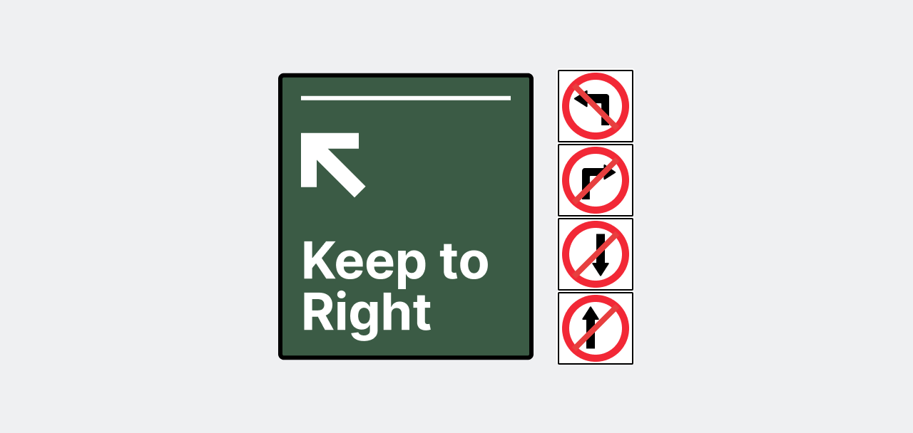
Road signage is also a great example of how you have to stick to a consistent patterns of visual styles and elements to convey data. Road signs wouldn't really work if every street sign could be a different color or have a different typeface or glyph. This is because user have a very brief amount of time to interpret the symbol and visual cue and then have to make a decision. So the message needs to be clear and concise for the user to fold it into their process without much effort.
So you should try and apply those same principle to any context where data needs to be conveyed in and effective way, UI and web design don't have the same level of urgency or potential consequence as failing to understand a road sign, but the consequences might be over time they grow frustrated with your product and opt for a competitor.
So the objective is to make the experience as smooth asn seamless as you can, you should be trying to remove any obstructions and limit the amount of time they need to spend thinking about the action they want to take. This will often mean you need to choose icons that are easily recognisable and can be interpreted with the least amount of effort.
It might be tempting to want to dazzle the user and creative a very overtly visual experience, but those experiences are short lived and don't represent the majority of how users interact with software and digital products. Most people are trying to achieve and objective and are looking for the tool that allows them to do that the easiest.
So no matter what icon set or library you end up deciding on, you should make sure that its function first before the form as this is the main purpose of the icon. A lot of beginner designers will choose very illustrative icons or add significant embellishments to them to make them interesting without realising that the cons being interesting is not the goal, the function is. So make sure your icons can be understood and are representations of universal actions, this way the user will have a smooth experience.
No matter what the project is, choosing the highest quality icons you can from the onset is going to save you a lot of time latter on in the project lifecycle. Better to pick wisely now than trying to resolve after UI has been created and icons have already been made or used.
There are so many icon sets that you could choose from but heres a few key factors to consider when making your choice for a quality set of icons.

Every project need is different and some require many more icons that others, but you shouls always make sure you project needs are covered. This dosent mean you need a set that has 5000+ or even 1000+, but it means you should try and make sure that the categories of icons are going to be used.
Even sets with thousands of icons can be 90% useless if the icons are in categories that you wont be using. So you need to aim for a set that has the essentials for your application. You dont want to be creating more icons later unless you enjoy that and can match the current style well. Even if thats the case, its better for your creative flow and speed to have a set ready to be used immediately.

Any set your use should be consistent through every glyph. Each icon should work harmoniously with the others and should be able to function in any UI application. This might take some time to get used to at the beginning but you will learn to identify when icons are not balanced and disrupt the experience.
You should be on the lookout for formats that you're going to use and be able to manipulate. So any files that are SVG or Figma are safe bets to use. Adobe software often uses EPS or AI, but bear in mind these formates don't work for most web applications and will need to be converted to SVG.
.png)
This factor is harder to apply than the others because when it comes to branding it enters into a bigger realm of subjectivity. One of the draw backs of trying to find bespoke icons that match the brand is, you will often go for sets that are more visually distinct because they align closer with the brand.
Icon sets can have a lot of variation but one of the easiest ways to see if it will match the branding is usually the border radius of the glyphs. Rounded icons have a more relaxed aesthetic and icons with no rounded feel more contemporary and strict.
Either type can work but it depends on your branding and products needs. no corners can be a bit harder to balance as the sheer edges direct the eye subtly, so if you're unsure there is a middle ground which is slightly rounded but no excessively.
Sometimes we feel like because we paid for something we got a better version that we otherwise could have for free. Icons get expensive and are not always well suited for your project, plus if you can save the money theres plenty of 100% free sets that are available to use.
If you choose to opt for a paid font, make sure to see if they offer any trial or allow a free version of the set, this can be a good way to see if you can actually use the icons. This can be tough though as often they leave out essential icons meaning you would have to buy the set anyway.
Whenever you start a project is good to assemble as many of the pieces as you can before you begin building, like you would if you were building something in real life, you don't want to have to return to the ships every time you need a new tool, you get them all ready before you begun.
This is the same for icons, if you start with a set that covers your needs, you wont have to pause creating the UX to go find or create a new icon. Quite often people will also make mistakes when designing new icons which means more inconsistency throughout the product.
This might not be a time consuming issues for a very small project, but the bigger the project the more painstaking it is to remedy those prior issue. You will end up incurring a huge amount of redesign work that can often take weeks if nots months, especially if your project is enterprise. This is costly and very boring work and you should avoid it.
.png)
If you take a look at the image above, you can see six different folder icons pulled from free icon sets online, these are all the same height and width, and as you may have notices, look terrible next to each other. Some icons in isolation look alright but get completely ruined depending on their context. Each designer has made certain decisions regarding the composition of the icon and once thats been made for the set it cant be undone.
Thus means the stroke size, color, aspect ratio and more will determine how that set should be used within the context of your UI. This does not work when you're trying to blending multiple icons together, that will never look right.
High quality icons should be fulfilling their purpose and thats to represent an action or path a user can take. They also make your product look more uniform and engaging, good icons should be doing both.
Even though it seems tempting or time saving to just mix and match icons from different sets, this is not a good idea and would almost always result in your product looking unfinished or buggy. If the icons are really bad it might actually make people distrust your product entirely and move on to someone else's. So make sure that you're using just the one set, and have that set be large enough to cover your bases.
Good icons can turn mundane UI into a positive experience for the user, they have a great deal of influence on how a user interacts with your products. A good set will also save you time and money invested by not being required to constantly stop every time a piece of content is created or requires a visual cue. It also prevents you making mistakes in creating new icons to match an exisiting set which can end up costing a huge amount later on to fix those issues.
So make your life easier and avoid all the issues and professional pitfalls of icon design and choose a high-quality library to begin with so you can focus on improving the UX an UI of your product without stopping to create new icons.
So here is this list of 100% free icons that you can get started with for product UI design.
{{content-divider}}

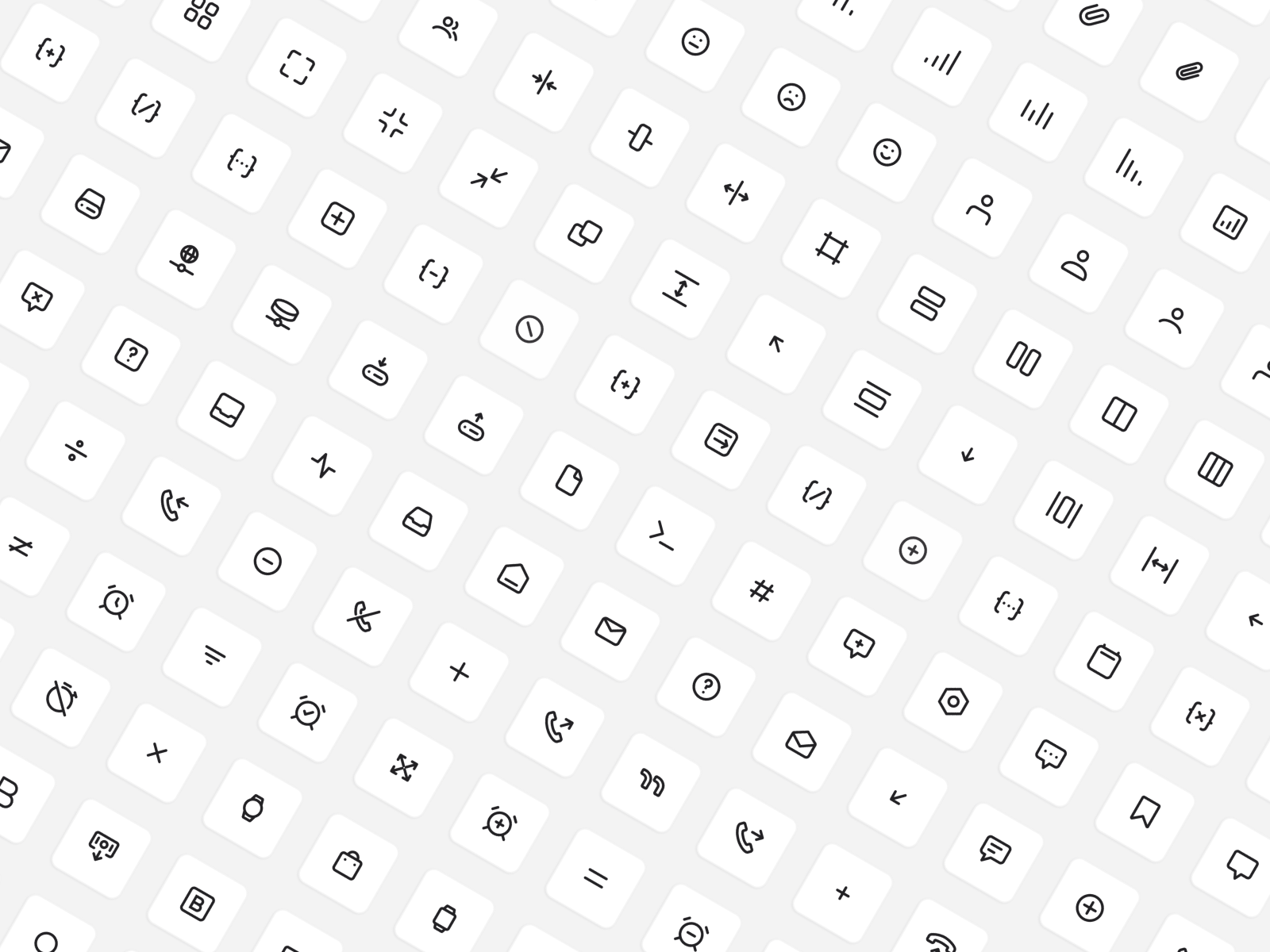
Stratis UI icons were designed for users to be clean, consistent and universally applicable to all their project needs.
This icon set is 1000% free and features over 1000+ line icons arranged and organised into 19 categories. At the current time additional styles such as filled and multi-stroke color is being created and will be realised next year.
Stratis UI icons launched late November 2022 and has been download 5000+ times in just over a week. You can see any updates, changes or planned products by checking our changelog. Otherwise you can use the icon set for as many projects as you like.
.png)
Stratis UI uses icons hand designed to be used across a wide range of applications. The library is 1000+ consistent and brand-neutral icons carefully built to ensure reliability and efficiency when being used across the web and product design projects.
After designing for a decade, we couldn't find a library that ticked every box, so we decided to just build one ourselves and now we want to share that with you.
{{content-divider}}

Feather Icons is a small yet very effective collection of essential icons. This minimalist line icon set was created by Cole Bemis and contains 287 elegant and neutral open source icons.
This set was designed using s 24 x 24px grid which is a standard format for icons in web and application design and is accessible due to its simple stroke style and consistent border radius. Lots of contemporary applications are opting for a lightweight and clean line icon style as they have been proved to be effective and look great in all modern UI. This library is available to download from the website in SVG format.
{{content-divider}}
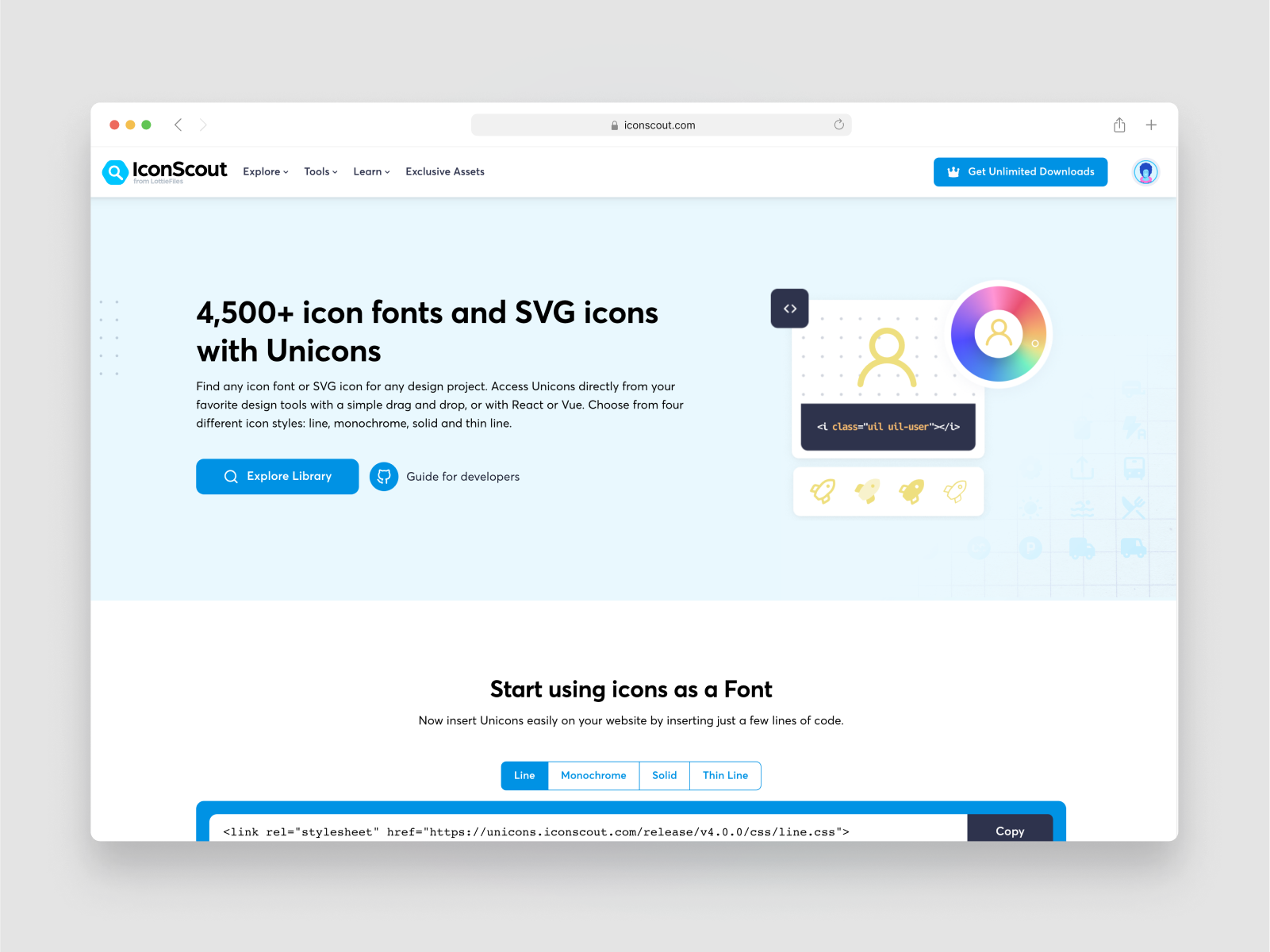
Unicons is a large library of over 4500+ icons across 4 different styles. The main library is paid but they have generously offered 1000+ pixel-perfect vector icons and iconfonts for your next project for free.
The 1000+ icons are designed on a 24 x 24px grid with a 1px stroke and are divided into 27 categories to make it easier to navigate and find the right icon. You can download the icon as a set of SVG's as well as take advantage of the icon/web font through their website.
{{content-divider}}
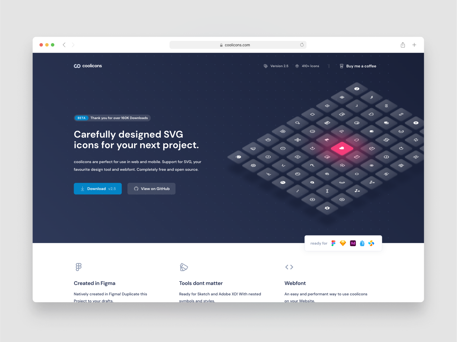
Coolicons is a free library of over 420+ essential icons in two styles. It was created by designer Kryston Schwarze who has made the library available free on the Figma community as well as available to download through is website and on github.
The icon set features over 420+ icons split between line style with some filled thrown in although no all line styles have a matched fill. The icons were designed on a 24 x 24px grid and is open source. You can download the library as either an SVG set or clone the Figma file.
{{content-divider}}

Majestic is a modern icon-set consisting of 720 free icons with two styles released through an MIT License .Carefully crafted with and for Figma. Change stroke-width, corner radius and colors easily.
Majestic icons were created by developer and designer Gerrit Halfmann. This is a great minimalist library thats well suited for website or application design. They are optimised to be used in Figma so swapping variants and color overrides is made much easier in this set. The icons were design on a 24 x 24px grid and each icon has a default 2px stroke width
If you find yourself need more icons you can always upgrade to the full library with 3,200+ icons divided into 48 categories. The library is available to download as both an SVG zip file and a clone-able Figma File
{{content-divider}}

Eva Icons is a pack of more than 480 beautifully crafted Open Source icons for common actions and items designed by Akveo and the team behind Eva Design Assets.
Eva icons is another minimal line style icon library that is great for contemporary product UI, the soft corners and rounded caps make this icon a pleasure to use.
This library comes in an outline and a filled styles and was built using a 24 x 24px grid. The library can be downloaded in PNG,SVG and a clone-able Figma file.
{{content-divider}}
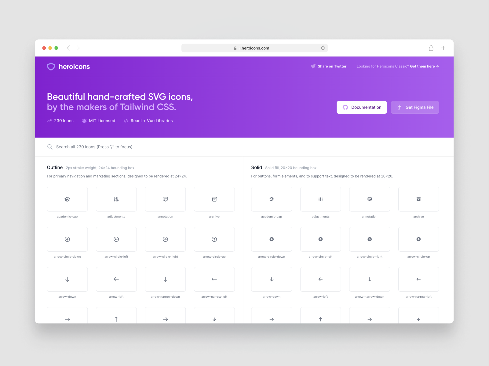
Heroicons is a beautiful hand-crafted set of SVG icons, by the makers of Tailwind CSS. The creator of the icons is a designer named Steve Shoger, it goes without saying that Tailwind has become a household name in design and development and these icons are another reason why.
The library is 230 MIT licenses icons that is divided into 2 categories filled and outline. The outline library was designed on a 24 x 24px grid and is intended to be used like that. The solid icon style is designed at 20 x 20px which is much more balance as the fills become too large at 24 x 24px.
You can download the icon as a set of SVGs via the website or duplicate the Figma Community file.
{{content-divider}}
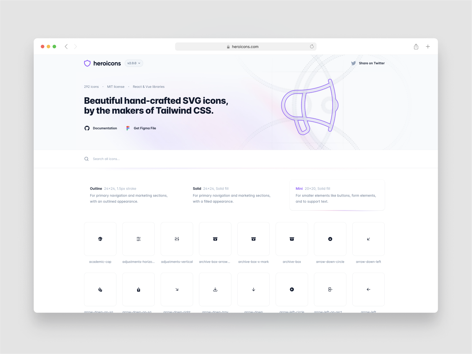
Heroicons 2.0 a follow up to the very successful and universally praise Heroicons 1.0. It was created by Steve Shoger, and launched in August 2022.
The new library features 292 icons split between two different styles outline and filled. On first glance you might not see a a huge difference but the set has been re-created and has some subtly in the forms that makes the set really unique. The outline set is as usually designed on a 24 x 24px grid and meant to be used for large formats whilst the solid fill set is again designed at 20 x 20px to not overpower the surrounding UI.
Whilst it's not a huge library, each icon has been created by Steve with such care and the curvature of the icon forms really gives the set a distinct yet modern feel. The icon set is 100% free with an MIT license and you can download the icon set as SVGs via their website or duplicate the Figma Community file.
{{content-divider}}
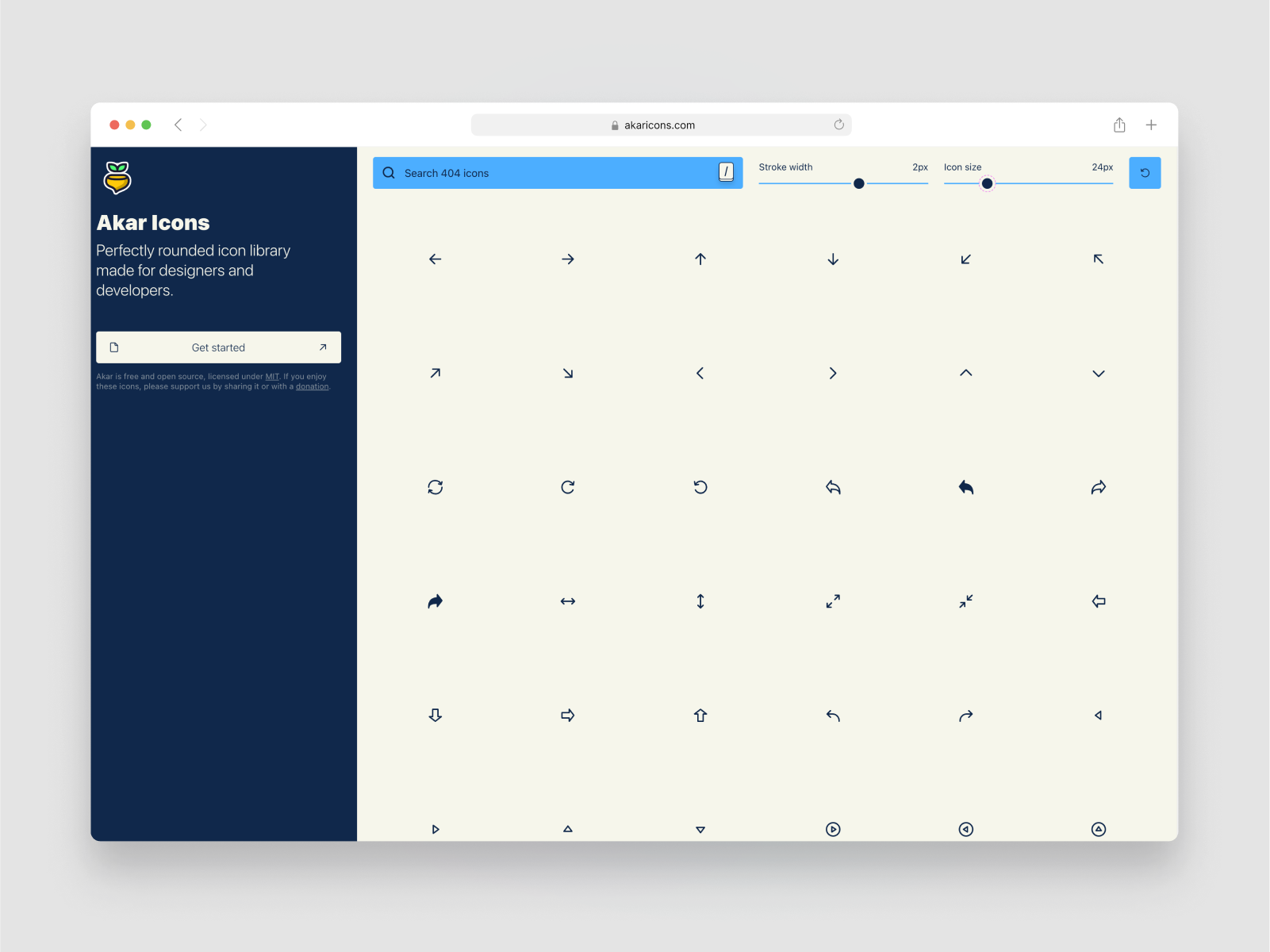
Akar icons is an open source icon library designed by Arturo Wibawa. The set included 404 icons with two styles, although the filled style is matched to the outlined version.
The icons themselves are a neutral and clean version of many other essentials icons sets but this set has a few unique additions to each icons that give it the extra edge. The dynamic stroke width and icon size preview on the website is a really great feature as it allows you to test drive the icons in real time to see if they match your project.
The icon set is released under the MIT License scheme and is free for commercial use. You can download the SVG's, React JSON as well as the iconfont from the Github repository.
{{content-divider}}
.png)
Streamline Icons are one of the biggest icon libraries on the web, with over 14,000 icons is a range of different styles, it's hard to come by this quality. As a part of their main set they offer 1000+ free core line icons that are made available under a source Creative Commons license.
This library includes a 1,000 consistent, minimal and carefully crafted line icons that will slide ride in to your modern UI projects. The core line icons are a part of a larger Pro icon set of the same name which features 2025 icons split into 14 categories. They offer a subscription or a out right purchase of $89.
You can download this icon set via their website as well as take advantage of their Native Figma plugin available on Figma Community which allows you to search for the icons inside your Figma file.
{{content-divider}}
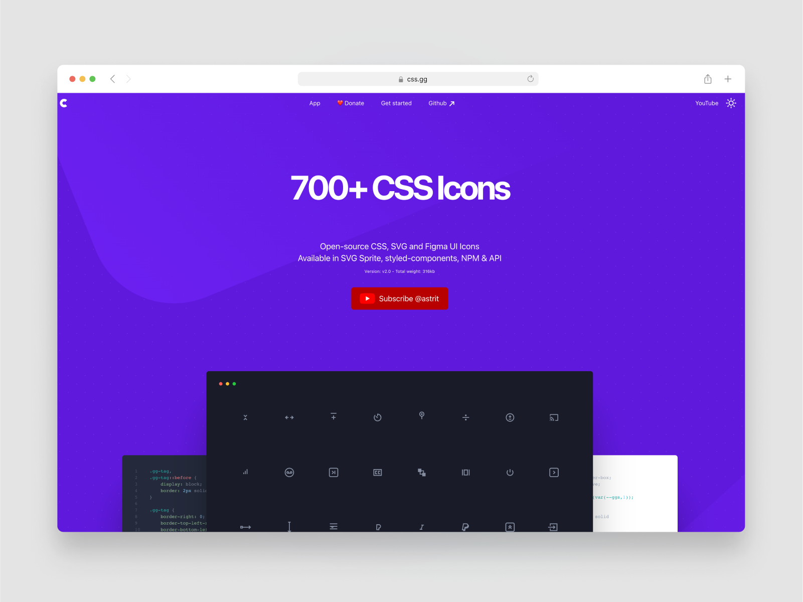
CSS Icons are an open-source CSS, SVG and Figma UI Icons set available as SVG sprite, styled-components, NPM & API. The entire set was written entirely in CSS so its web forward.
The icon set is consists of 704 free icons available as CSS and SVGs. It was created by Astrit Malsija, who also has a YouTube channel with useful wen development and CSS tips. The set is available in both CSS components as well as a Figma file.
{{content-divider}}
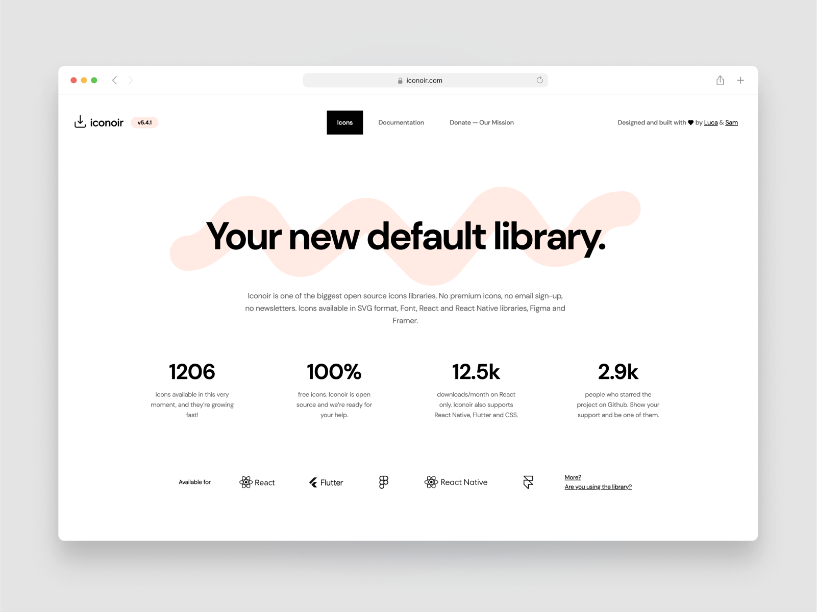
Iconoir is an open source icon library created by crafted Designer, Lucia Burgio. It comes with 1200+ icons in a range of formats that include SVG as well as libraries for React, React Native, Figma, and Framer.
This is another great minimal library but there is also a lot of icons that are original takes on some established forms which is great to see. These icons are perfect for dense product UI design and website design.
The Iconoir set open source and 100%, as such, if you have used the library ad found it helpful it would be great if you could donate to support the creator on Open Collective.
{{content-divider}}
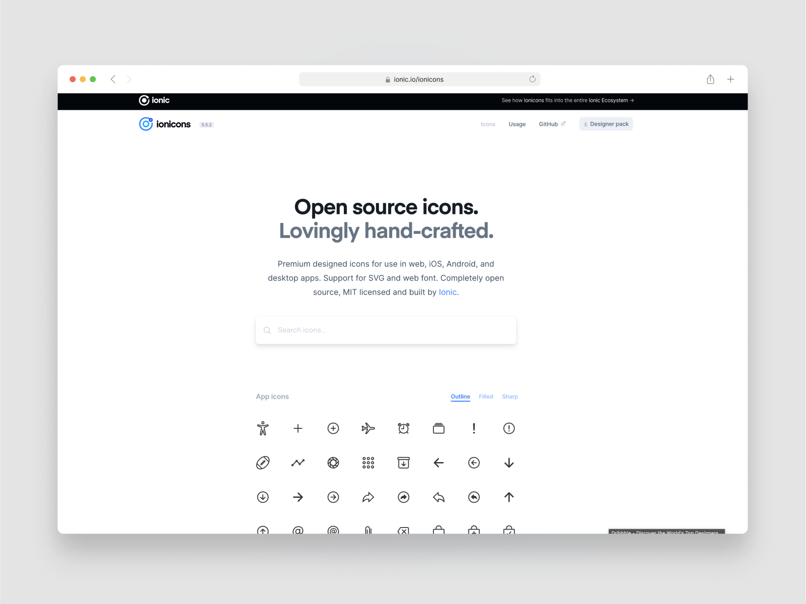
Ionicons are an open source icon library built by the team behind the Ionic framework. The icon set is 700+ icons with two styles and is realised under a MIT licensed.
These icons are a nice reliable set that will look good in most contemporary UI scenerios. As will as being able to download the icons set as a SVG zip, you can also use the Ionic teams l Figma plugin which allows you to search for icons from inside Figma.
{{content-divider}}
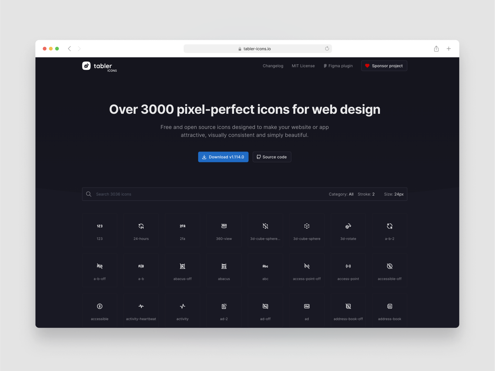
Tabler Icons is a massive set of icons crafted by developer, Paweł Kuna. This library is as versatile as it is large, there is no icon you wont be able to find making it a must have for larger projects with very nice icon requirements.
The icons set has more than 3000+ icons in a line style that can be previewed at different sizes and stroke widths to make sure its compatible. The library is released as an open source set 100% free but you can donate to Pawel GitHub.
{{content-divider}}
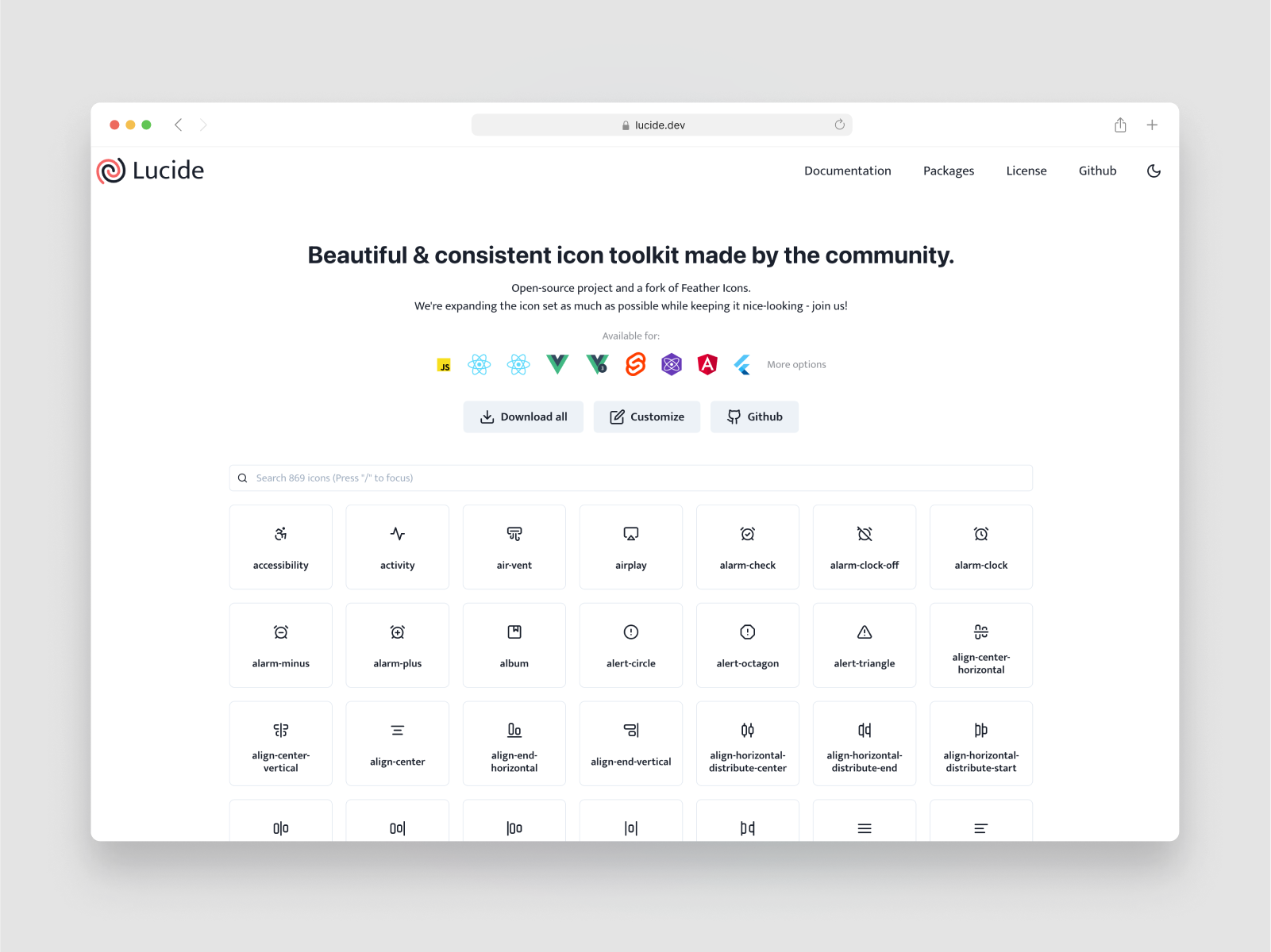
Lucide Icons is a large set of community contributed icons made open source to remedy the issues with the Feathericons projects. Developers and creators were finding the project t0o difficult to work on so Lucide has become a fork of the Feathericons project now with contributions from everyone.
The icons set has a large 869 line style icons designed at 24 x 24px. This is a very lean and minimal library that like Feathericons is perfect for dense UI and development projects. Lucide is trying to expand the icon set as much as possible while staying faithful to the original simplistic design language. This is achieved by community of devs and designers and new additions are always welcome.
You can download the icons as a set of SVG's as well ass download a range of dev formats and packages from the Github repository.
{{content-divider}}
It goes without saying anytime to create a list you have to leave some entries off as other wise the list becomes a massive saga of unending additions. We did this because the operative word is "best" and not largest or even "most used" as this isn't always the best option for current UI design projects.
The best of list trope is now often a marketing approach to try and game Googles search engine, which is why you can icon libraries that have thousands of icons that are all mismatched and not uniform because it helps rank better. We didn't include some major players in the list as the overall quality and utility is lower but here are some other mentions.
{{content-divider}}
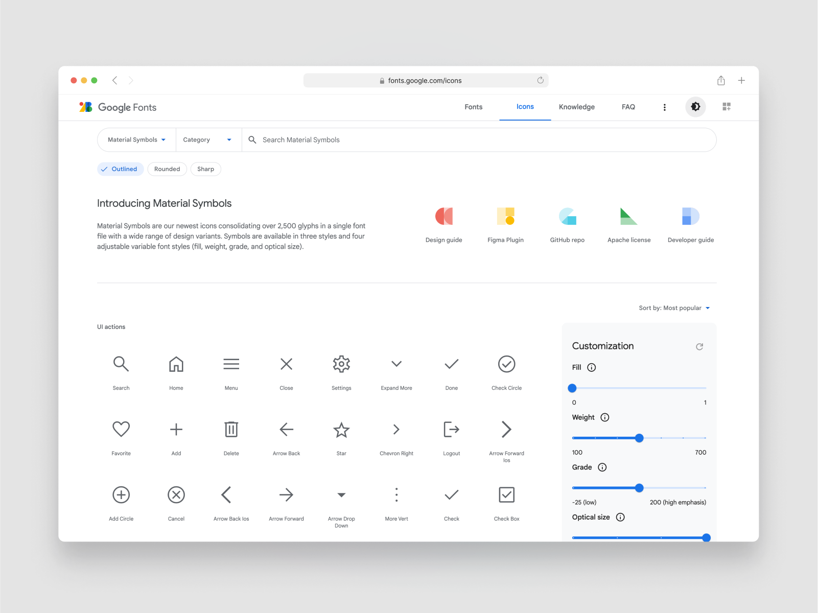
Material Icons s a free icon library by Google for their own Material Design system. This icon set is 100% free and open source under the Apache License Version 2.0.
Th icons are made available in five different styles, filled, outlined, rounded, two-tone, and sharp. If you've worked in tech you would have no doubt come across this library. As well as being able to use the icons as a font , you can download the glyphs in PNG and SVG formate as well as use them through an official Figma plugin Material Symbols Figma plugin.
Material icons is a very large library and its universality can make it more appealing, however, we decided to leave it off the list as its quality is subjective at this point. Int not really going to be well balanced with modern UI interfaces, so much so that Googles themselves don't use their icons in all their own products.
{{content-divider}}
{{content-divider}}
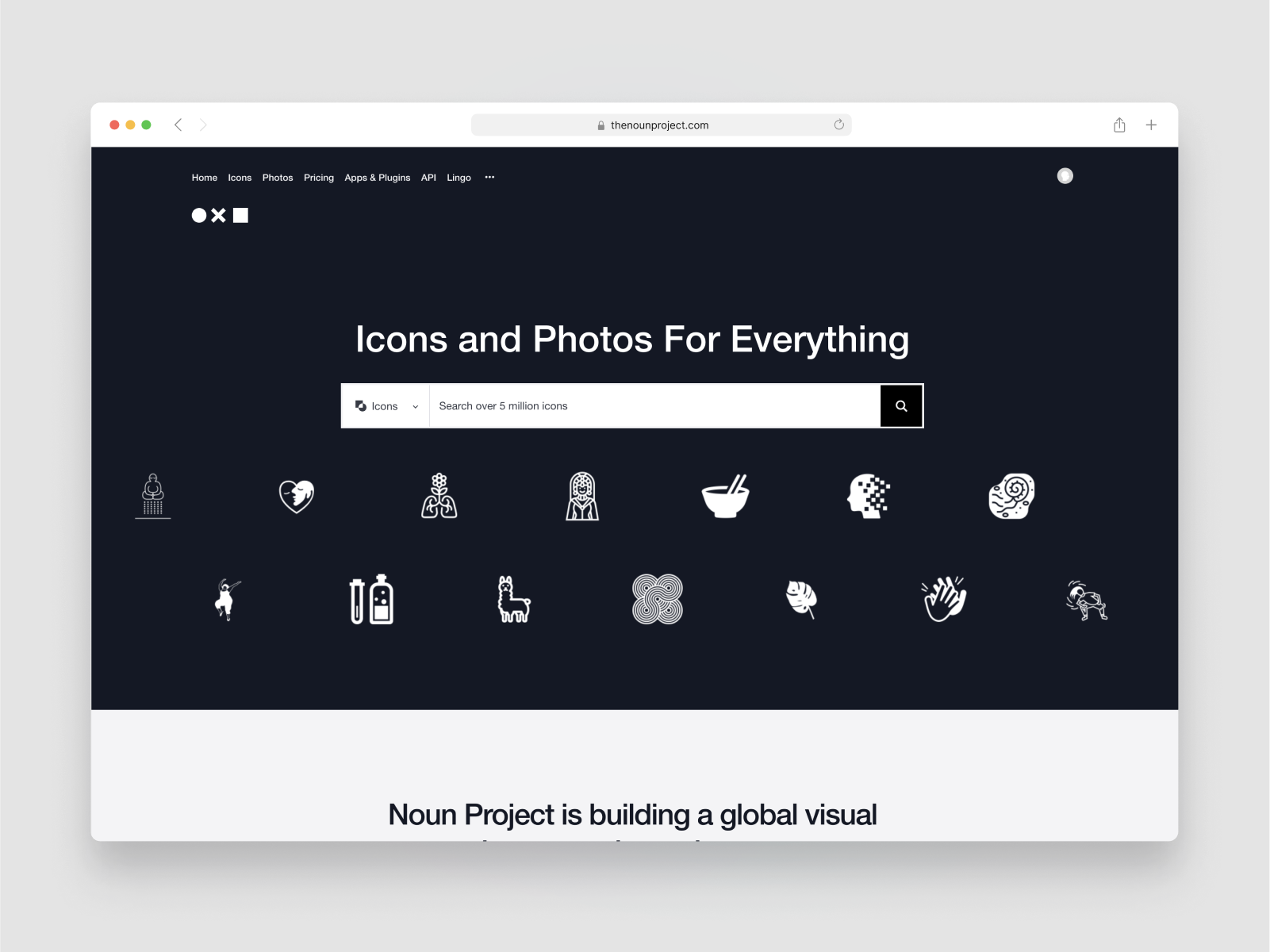
The Noun Project is a collection of over 5 million icons. Theres not a icon that doesn't exist in this collection and then some. There are icons for applications, social medias, integrations anything you can think of, it's there. Collection has been growing since its launch in 2011 and it's contributed by thousands of developers and designers daily.
So as you can see there isn't want for quantity, however its fairly self evident that 5 million icons will have next to no consistency. So you'll be lucky if you can get get even a handful of icons to match and to be fair, a lot of the icons are particularly well made or nice to look at. Less is more, and you need much much less this. Another reasons is the attribution requirements, if you use icons you need to attribute back unless you pay for membership, so its a free library sort of.
{{content-divider}}
Font Awesome is a font and icon toolkit based on CSS and Less. As of 2020, Font Awesome was used by 38% of sites that use third-party font scripts, placing Font Awesome in second place after Google Fonts.
Their free open-source library includes at time of writing 2,18 free icons across several styles. They also have a paid version of their iconfont which gives you access to 16,000+ icons. Whilst this is an impressive number again similar to Google and The Noun Project, quantity does not trump quality. It's also a matter of how easy it is to find the correct icon, sometimes massive libraries are more of a hinderance than they are helpful.
.png)
{{content-divider}}
Bootstrap Icons is a 100% fee, high quality, open source icon library. Named after the associated Bootstrap CSS framework, this icon library has more than 1,800+ icons two styles, outline and fill.
Bootstrap icons suffers from the same woes as Material Icons and Noun. Hence why we have omitted it from the main list. Whilst its a very big library and still useful, a lot of the icons are looking a bit old. They still have the same aesthetics as the Material icons which means theres a lot of continuity issues and balance problems. So if you're building in Bootstrap it might be useful but there are plenty of other free libraries that would serve you better for modern UI design.
{{content-divider}}
Theres no way to keep up with every new icon set being released, between github, and creative marketplace as well as all the independent design marketplaces, theres to much to go through. So we tried to find the highest quality as most useful sets for modern UI and product design.
If you have any sets that you think should be on this list, or are planning to release a free kit, get in touch with us as we would be happy to view it.


.png)


